75 photos
The unique potential of the modern method for three-dimensional visualization of the interior will allow you to look ...
In the general color palette of the interior designer, there are several shades that will decorate any interior. Pink is one of them. There are numerous stereotypes regarding him: Barbie's house, sweet life, style of a little girl. As a result, most owners are afraid to bring this color into the interior of their home. More persistent creative design specialists will be able to explain that all of the above is just fiction. If you look at all the many shades of pink, you will surely find a suitable occasion.
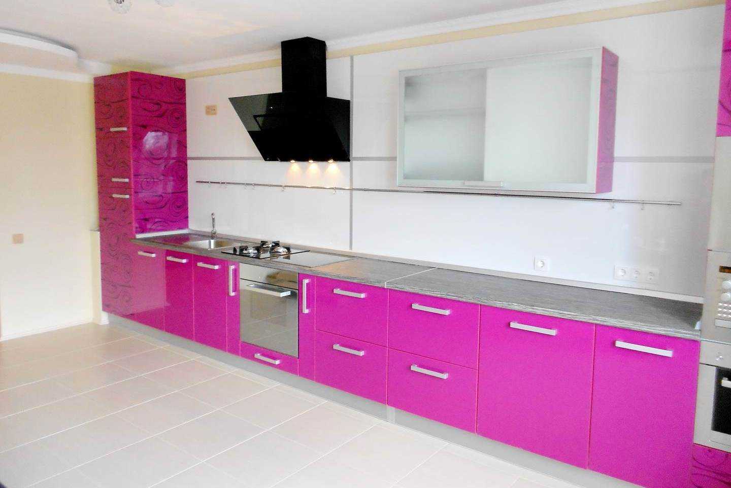
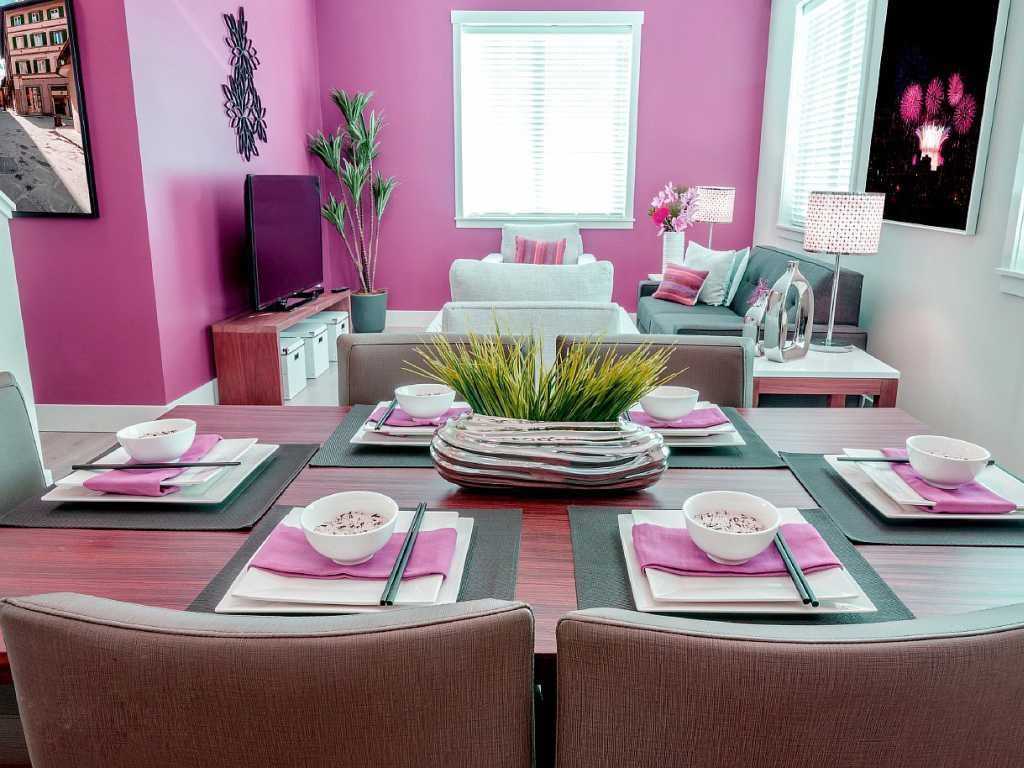
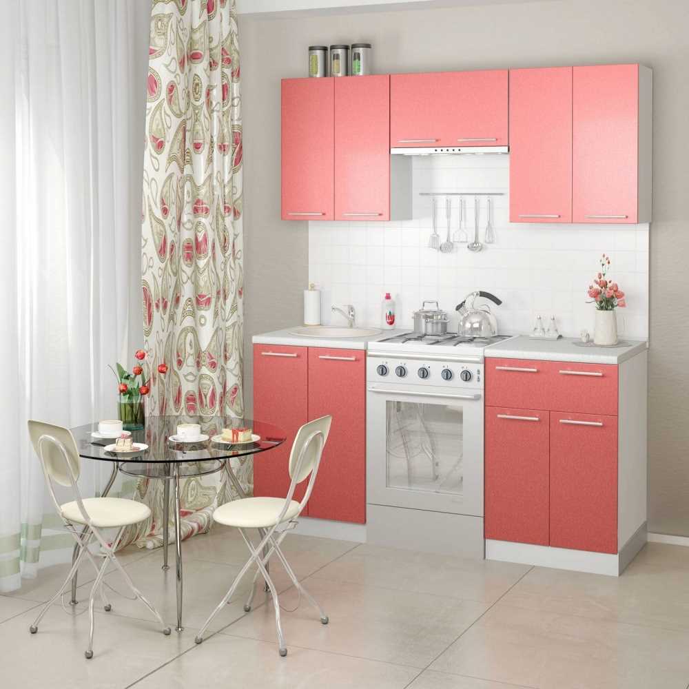
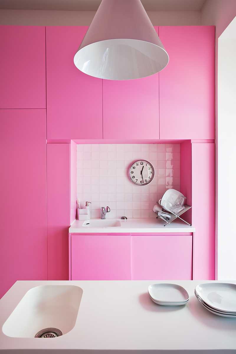
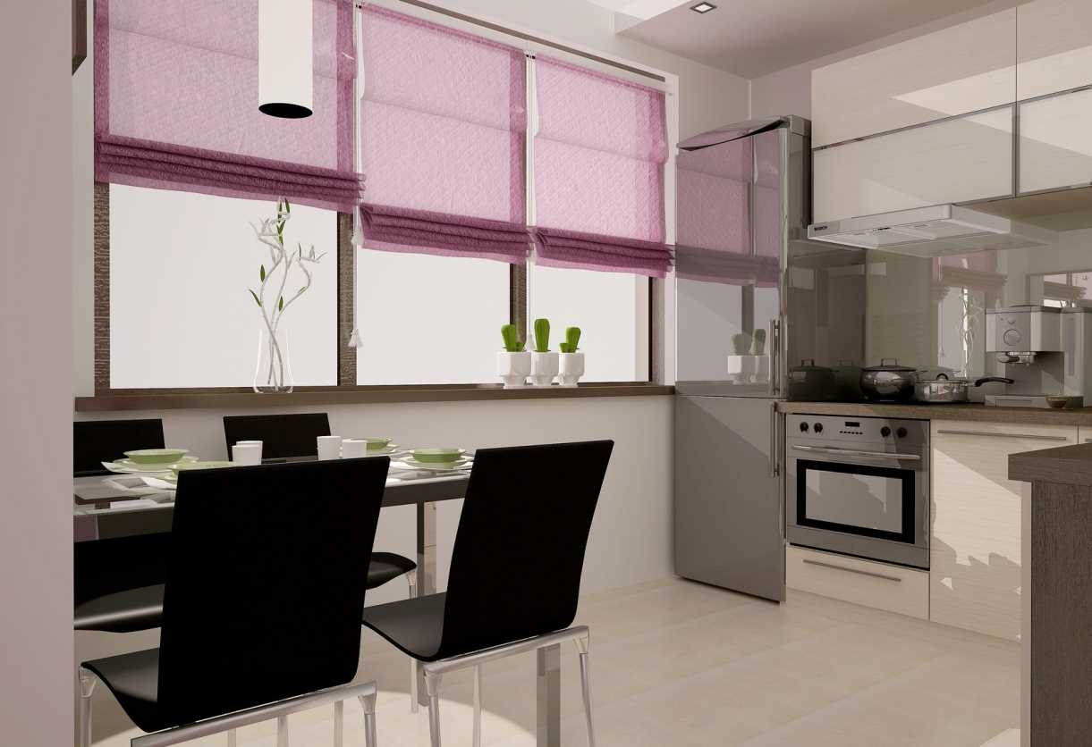
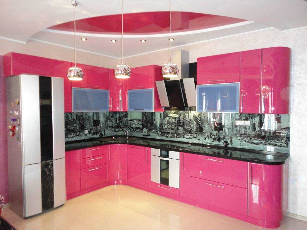
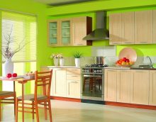
Pink color is perfect for the interior of the kitchen
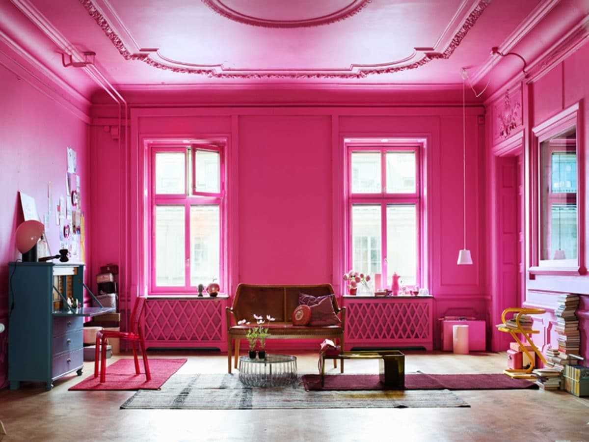
Pink color can decorate any interior
Designers often use pink.
Content
The direct meaning of pink in psychology is femininity, tenderness, friendliness. If you take light colors, there will be an embodiment of lightness, bright, screaming - passion, selflessness.
Medicine has its own opinion on this color in the interior. Usually they paint the walls of the wards, intensive care, operating rooms. It accelerates cell recovery, improves mood, helps to get out of depression, restores the emotional background.
Features of perception.
- The interior, decorated with a pink hue, gives a feeling of lightness. In such a room, I don’t want to think about business or problems. I want to relax, relax. Therefore, pink is not used in the design of cabinets, office premises.
- Upsets, removes aggression.
- Fills with vitality, a person feels a surge of strength and energy.
Pink color is able to give a feeling of lightness
Pink color cheers up and fills with strength
The main rule for the competent use of pink is no more than 50% of the rest of the tint used in working with the room. Exceptions may be light colors: peach, beige, coral, lilac.
The pink color in the interior provides its creator with great opportunities for imagination and the manifestation of impeccable taste. You must not forget about a few general rules.
- The use of visual, optical illusion.
Playing with different colors, you can visually make any item more voluminous, weightless. For example, one of the four walls is decorated in pink, the space is "parted", the ceiling is "raised." You can also play with tones of furniture. For example, if the table and sofa are painted light lilac, they will look more massive. The same can be done with the bathroom, in the kitchen, in the bedroom.
In the interior of the pink color should be no more than 50%
Using color, you can make any object more voluminous
Pink has a lot of shades, choosing the right one is easy
- “Temperature” colors.
Pink color is very multifaceted, it has both cold shades and warm.
Cold ones are gray-pink, fuchsia, raspberry, lilac, magenta.
Warm - dark pink, coral, tea rose, peach, salmon.
- Competent selection.
Giving preference to any tone, it is necessary to remember that everything should be in moderation. Even the most neutral color, covering all four walls of the room, quickly get tired.It is better to play with several types of tinting. All shades of green, turquoise, yellow, brown, gray harmonize perfectly with pink. To pay special attention to any object, it is recommended to paint it in bright, saturated colors. To dilute dark pink in the interior, you can take lilac, white, beige.
Color should be selected carefully
The room can play with shades
- Matching style.
This shade is allowed to apply in the design of the style of any room. But, the main thing to remember is that each style decision has its own principles and limitations. Retro and pop art allow the presence of bright pink tones paired with classic black, white, orange, turquoise. The Scandinavian style “loves” rich pink details, the classic direction takes only light shades.
- Moderation.
Each setting can be made both unique and tasteless. In most cases, wanting to make the interior as original as possible, the owner forgets about the sense of proportion. You should not take as a basis a large number of shades, 1-2 basic ones are enough, 1 as an accent. You need to select them as carefully as possible.
Pink color is more suitable for girls
There shouldn’t be much pink in the room
Pink goes well with other colors
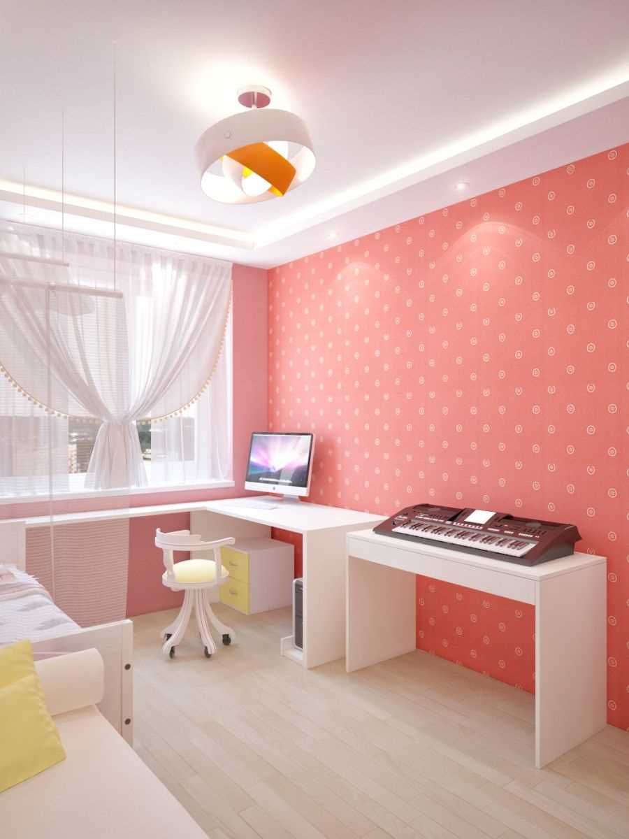
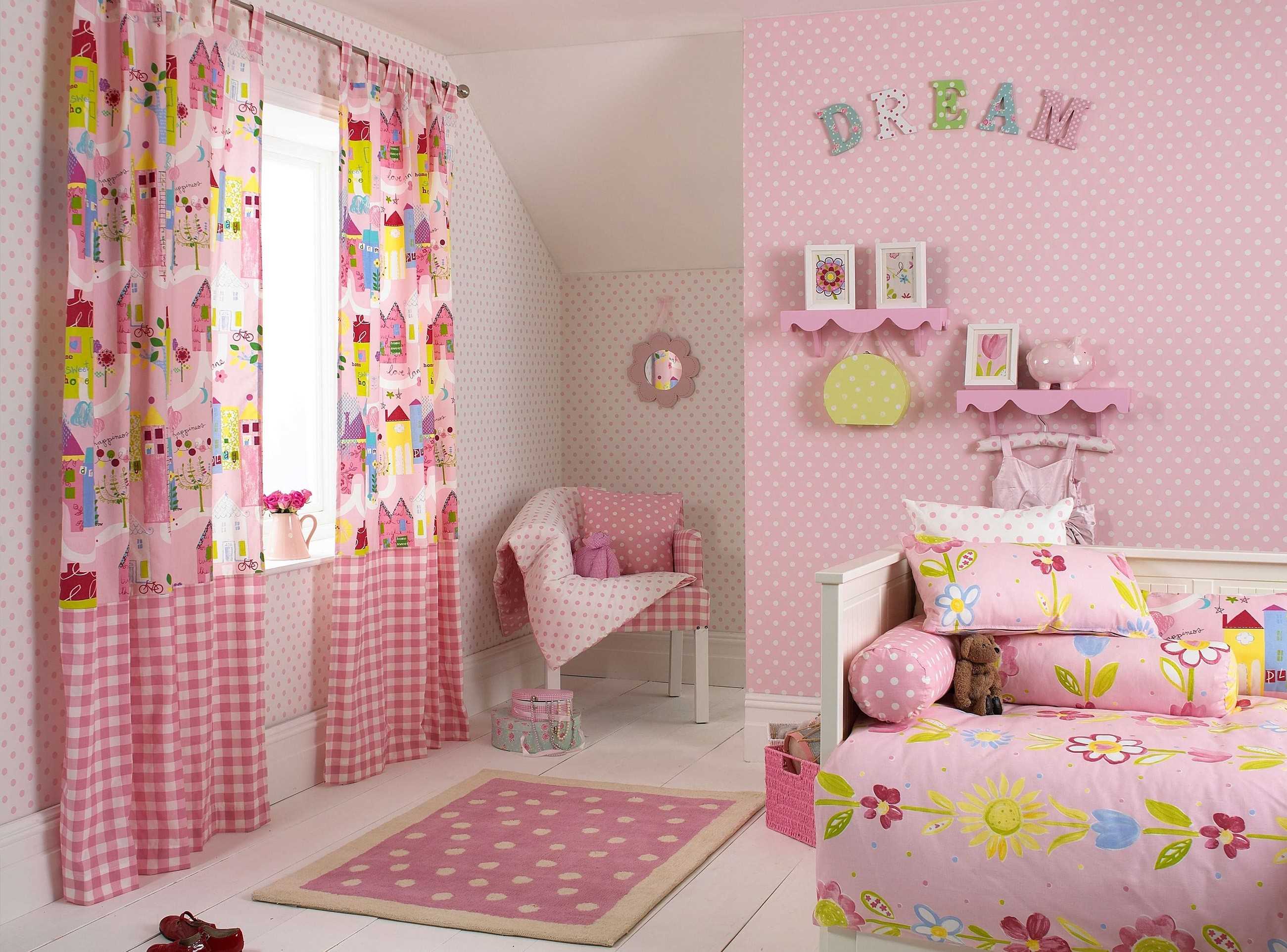
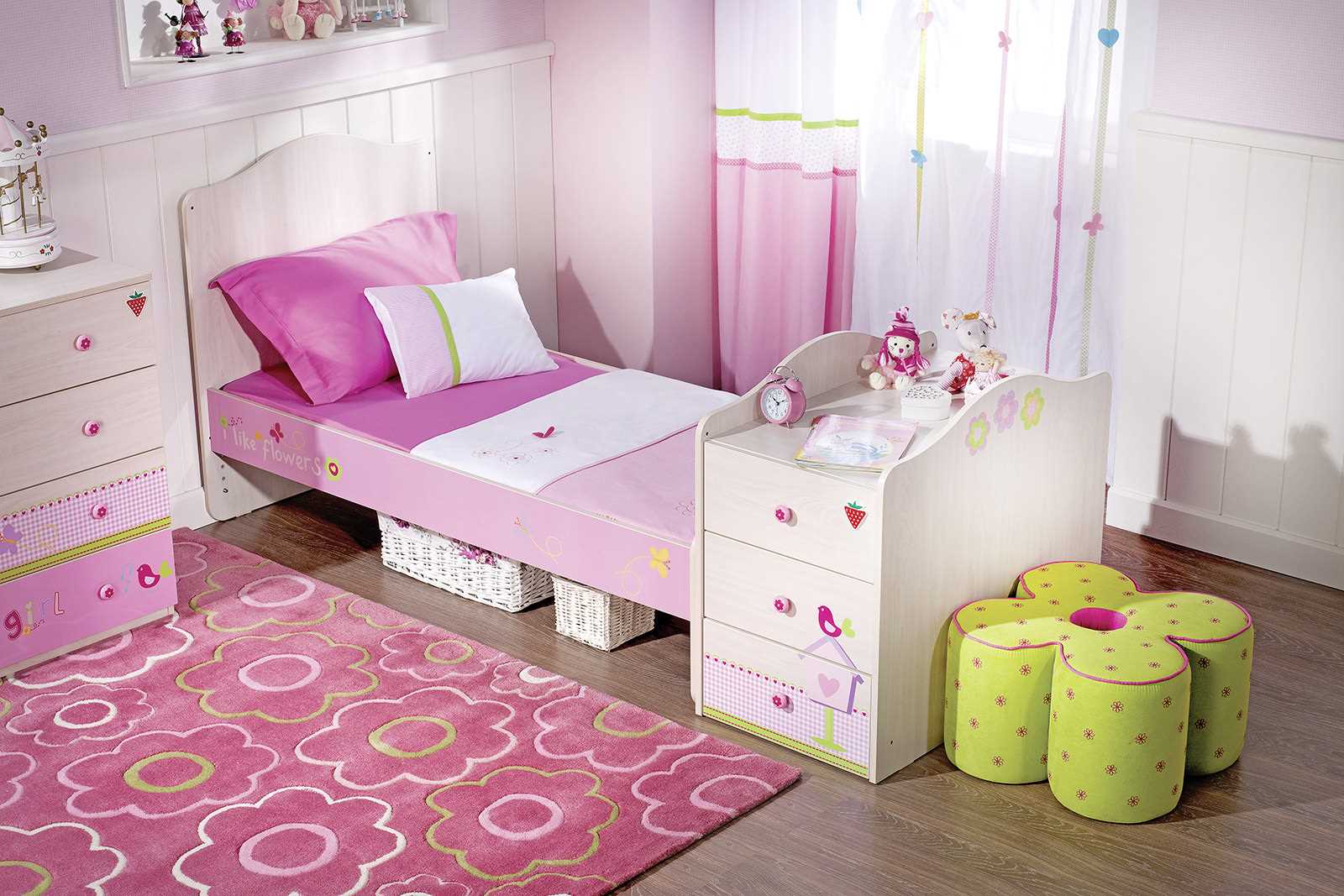
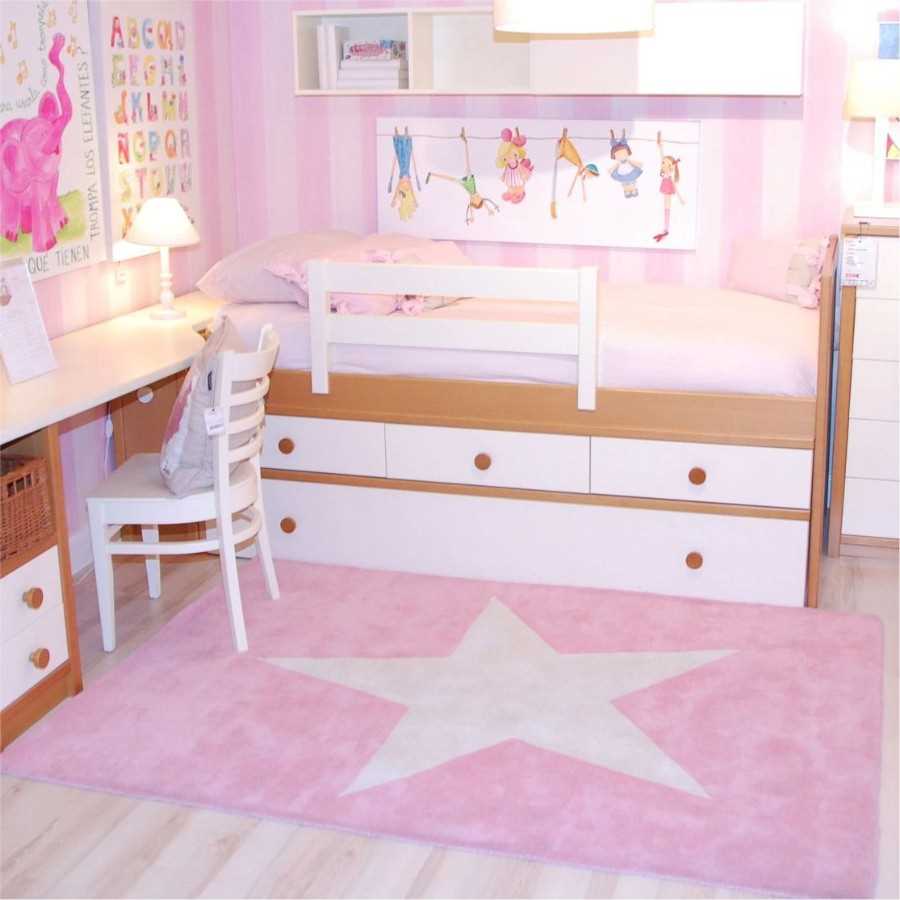
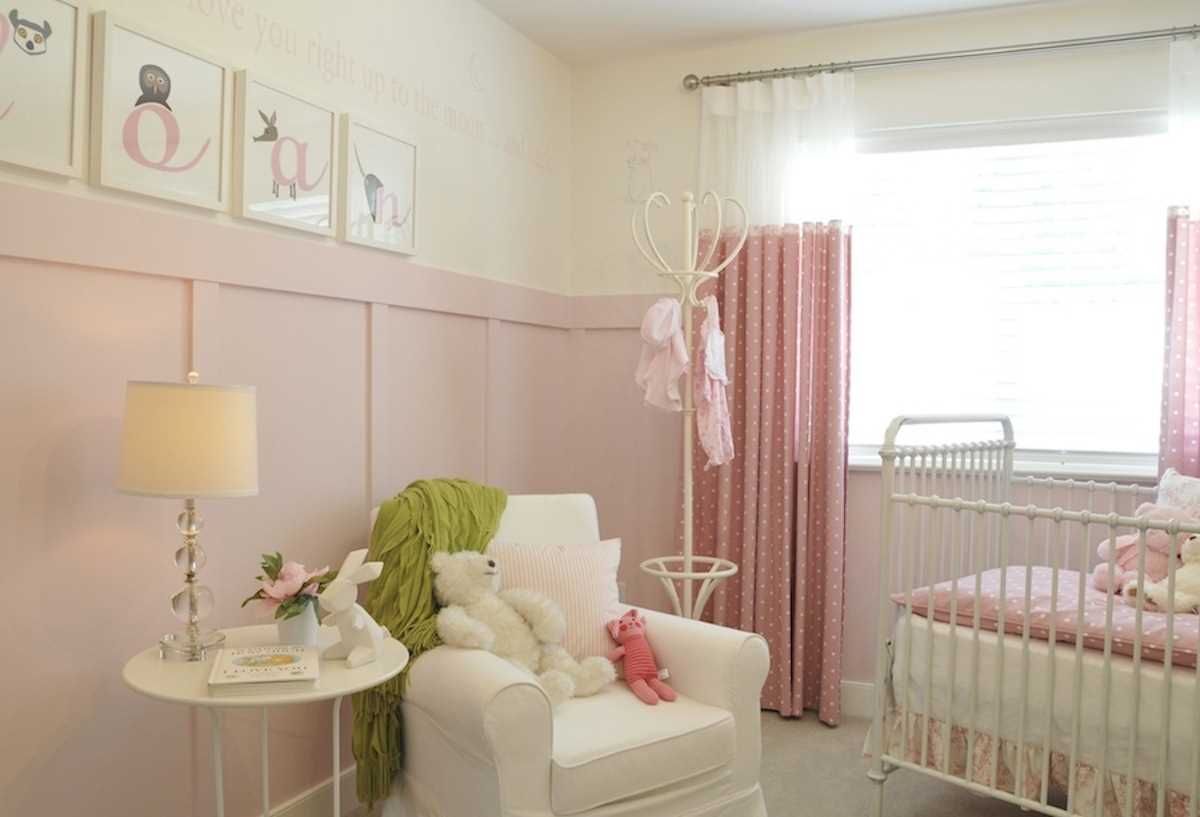
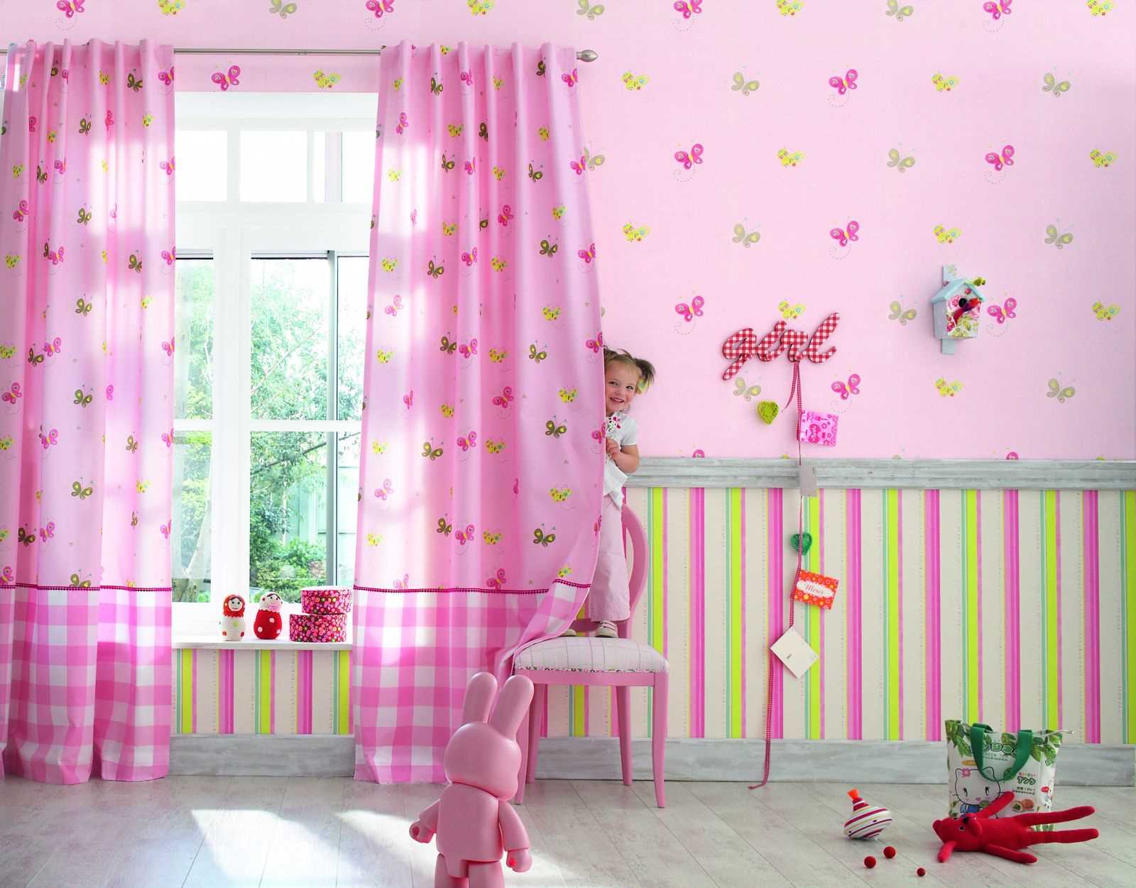
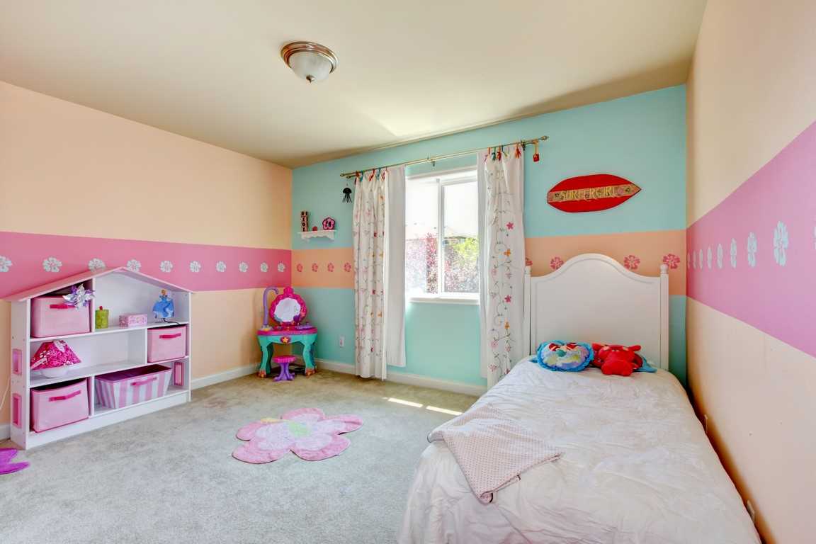
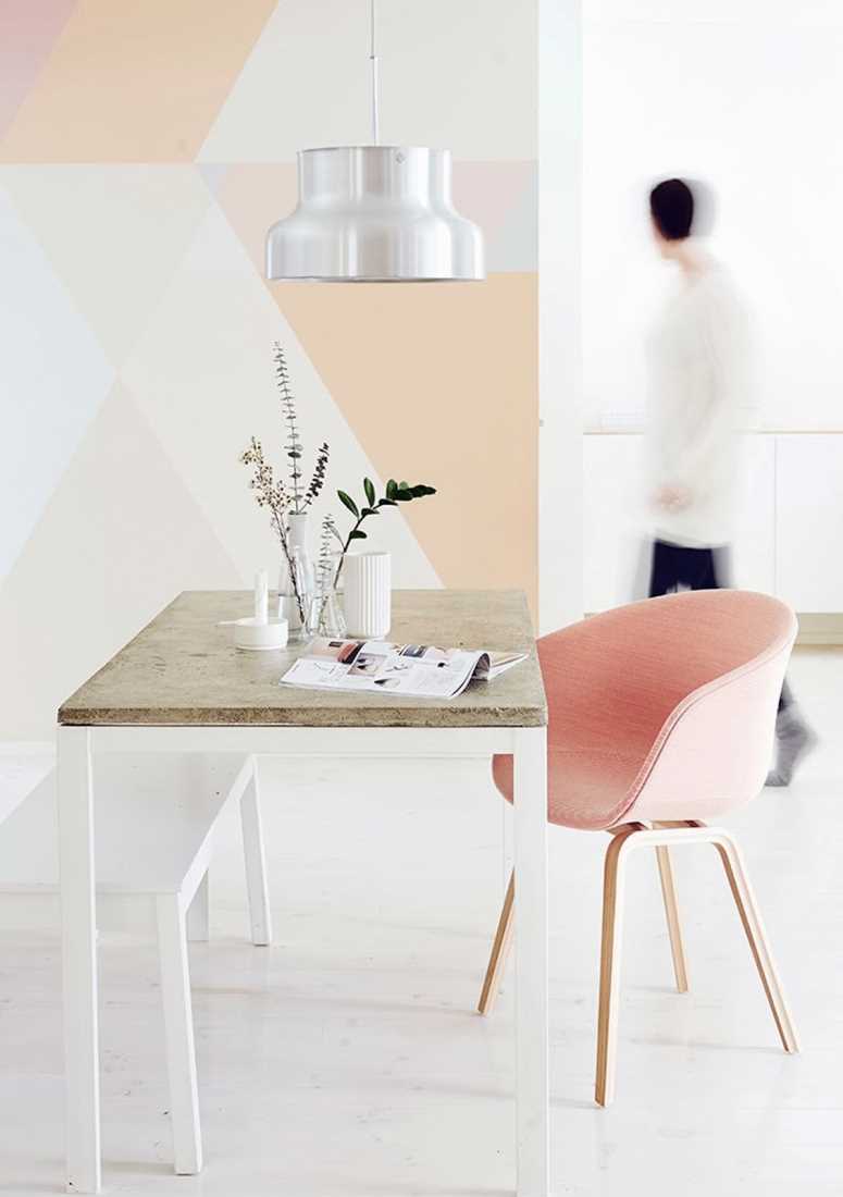
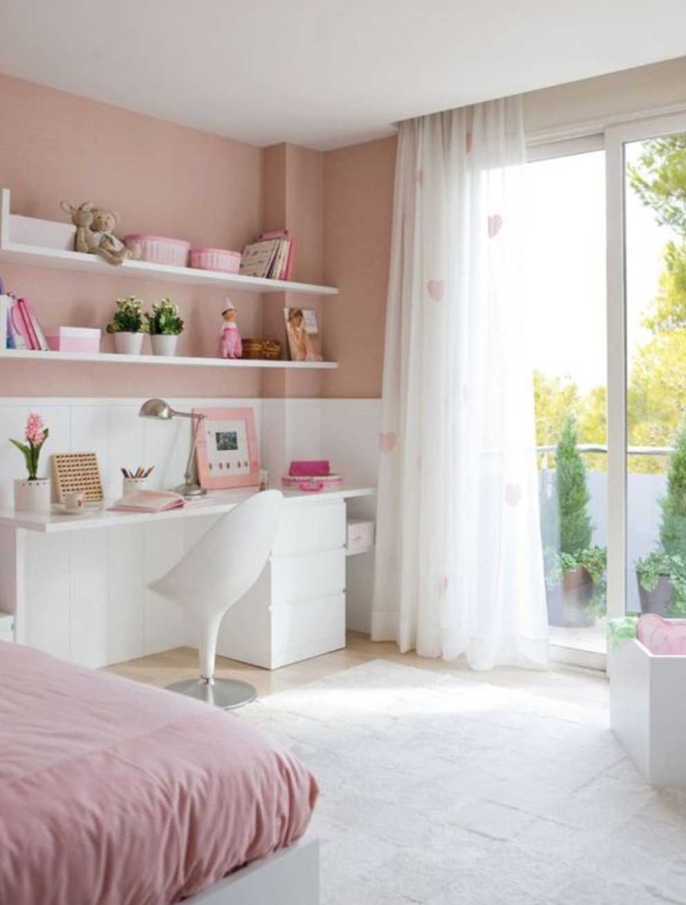
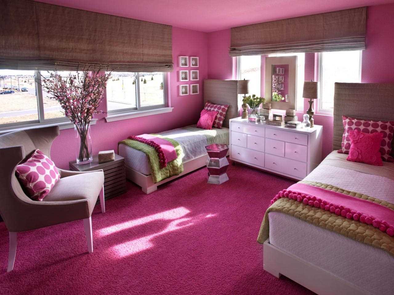
Most often, this shade is used in the work to create a children's room for a baby, a girl’s bedroom, less often - a kitchen, a bathroom.
Pink color in the interior of the kitchen will increase appetite. It is allowed, but with caution, to work with saturated tones - fuchsia, raspberry. They will tune in a positive way, improve mood. For calmer families, neutral pastel lilac, light pink are suitable. The perfect complement would be chrome kitchen appliances, furniture elements in white.
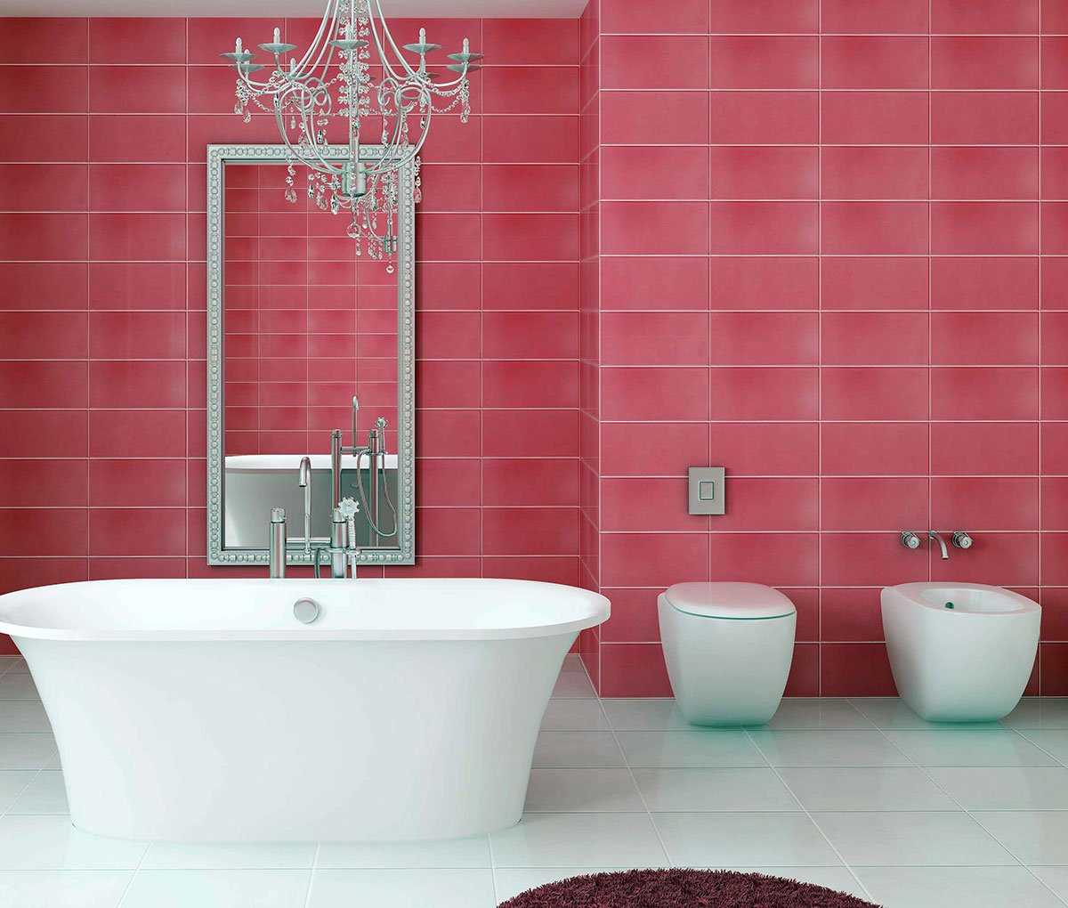
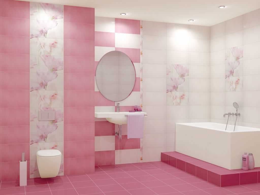
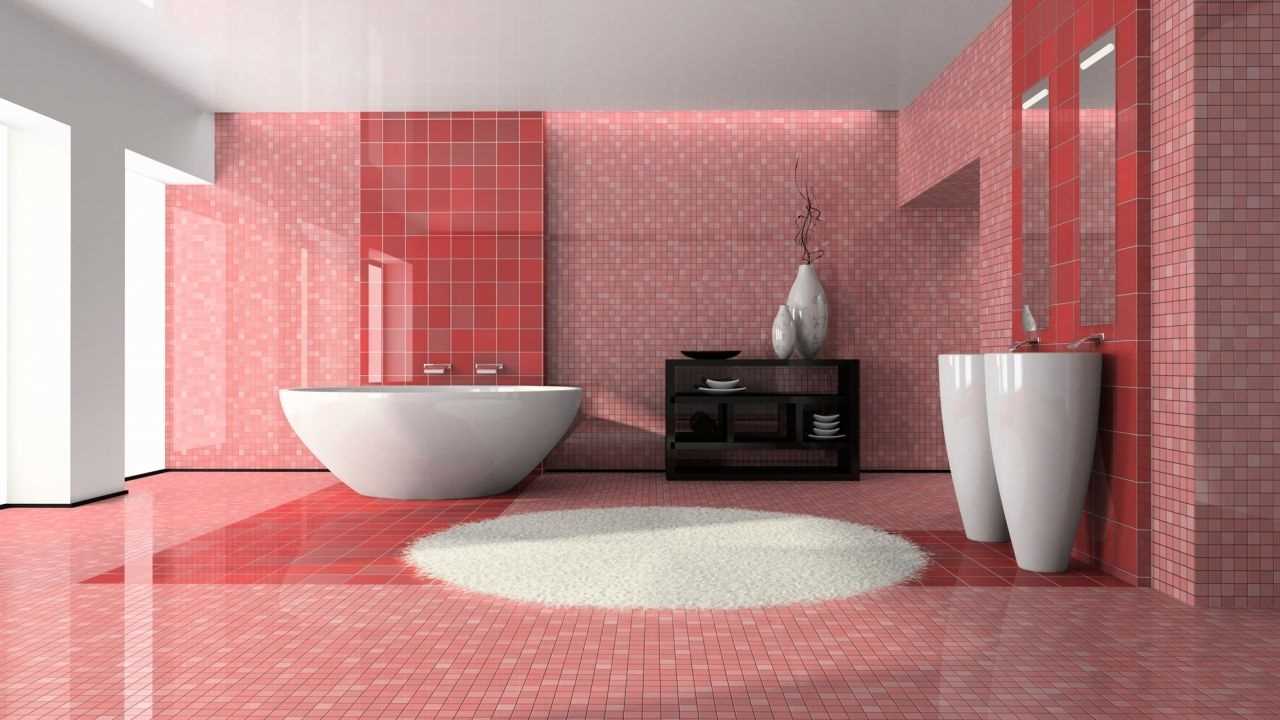
The bathroom will look rather unusual. In pink shades, it is decorated with romantic natures. In other cases, you can recommend adding 1-2 accent details of light tones to the interior. They will make the space wider, the room more “warm”. It is possible to get rid of excessive "finesse" and frivolity by adding black to the interior.
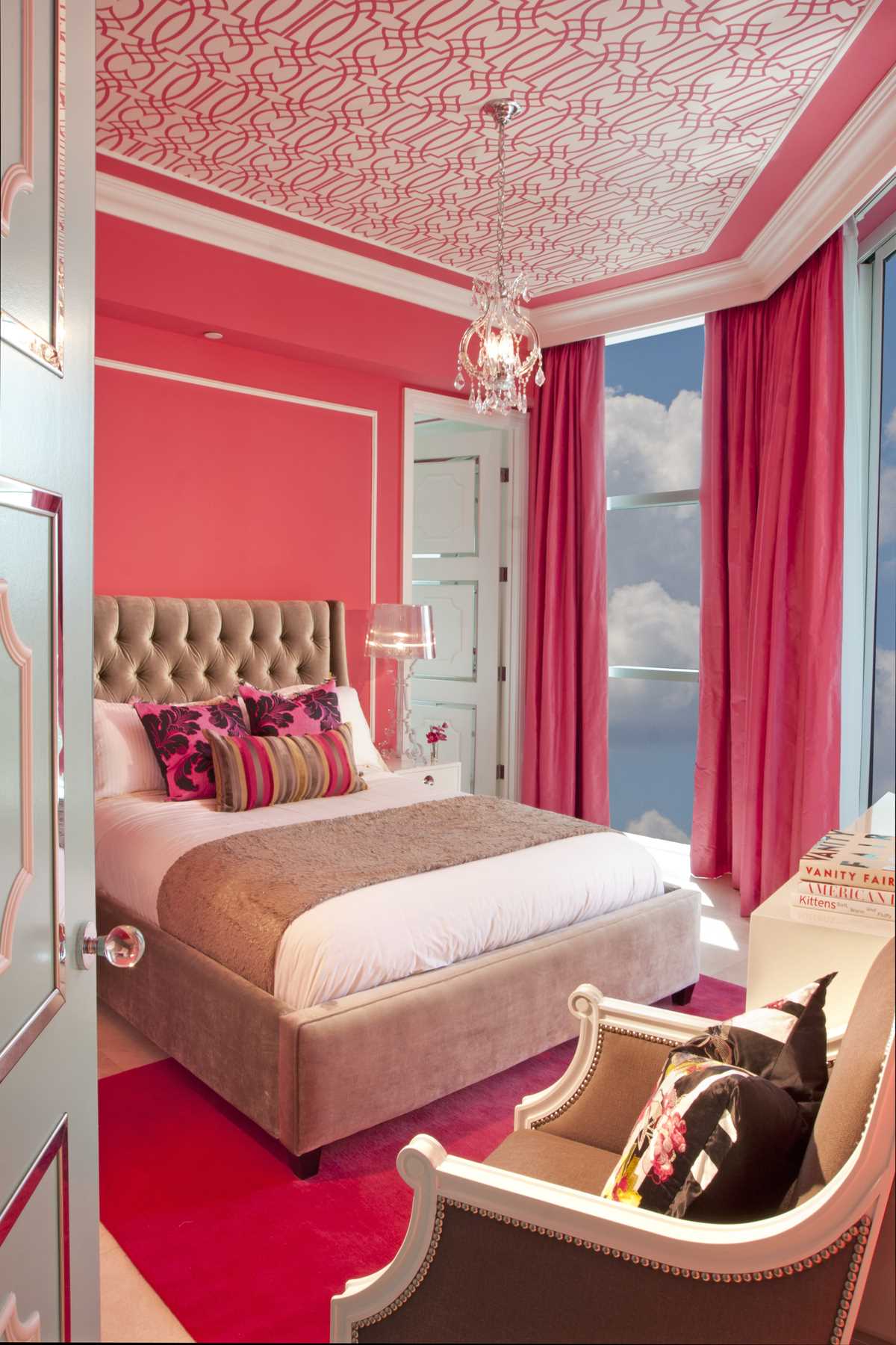
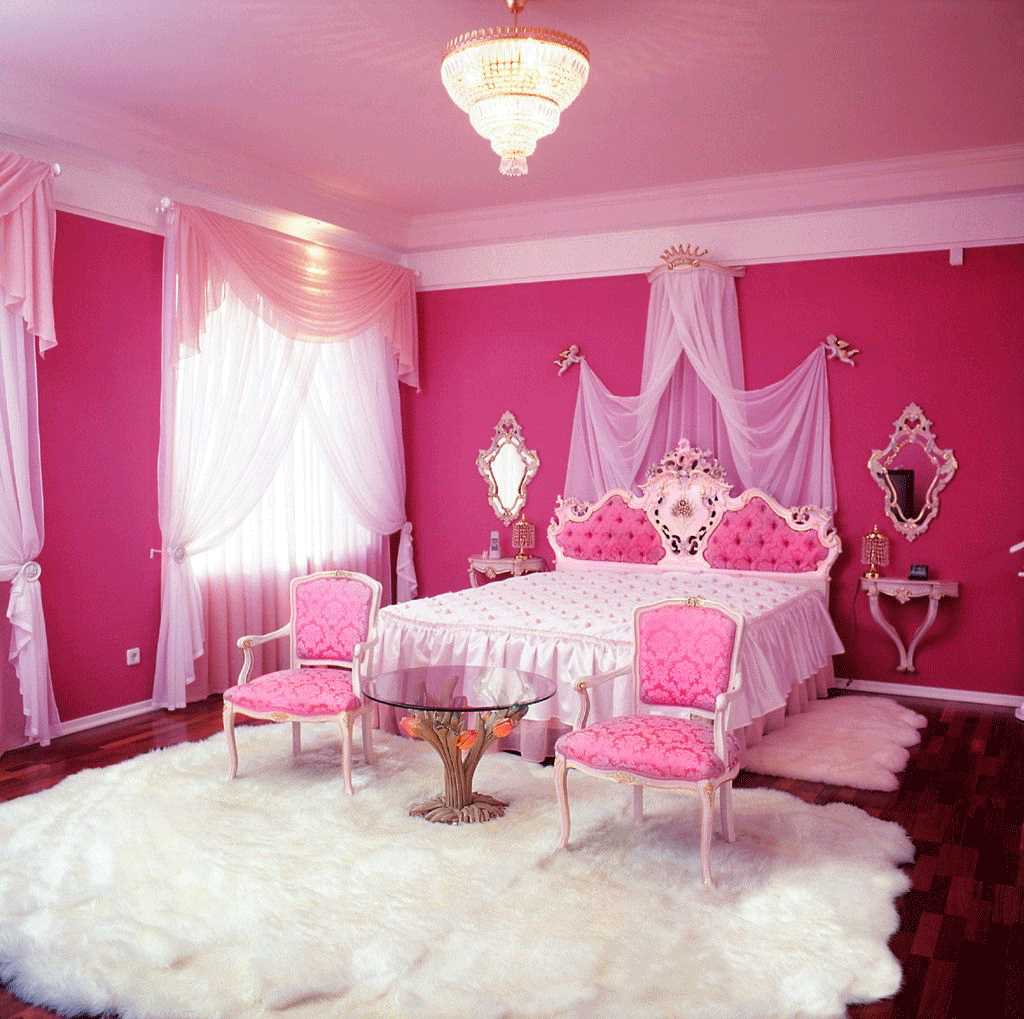
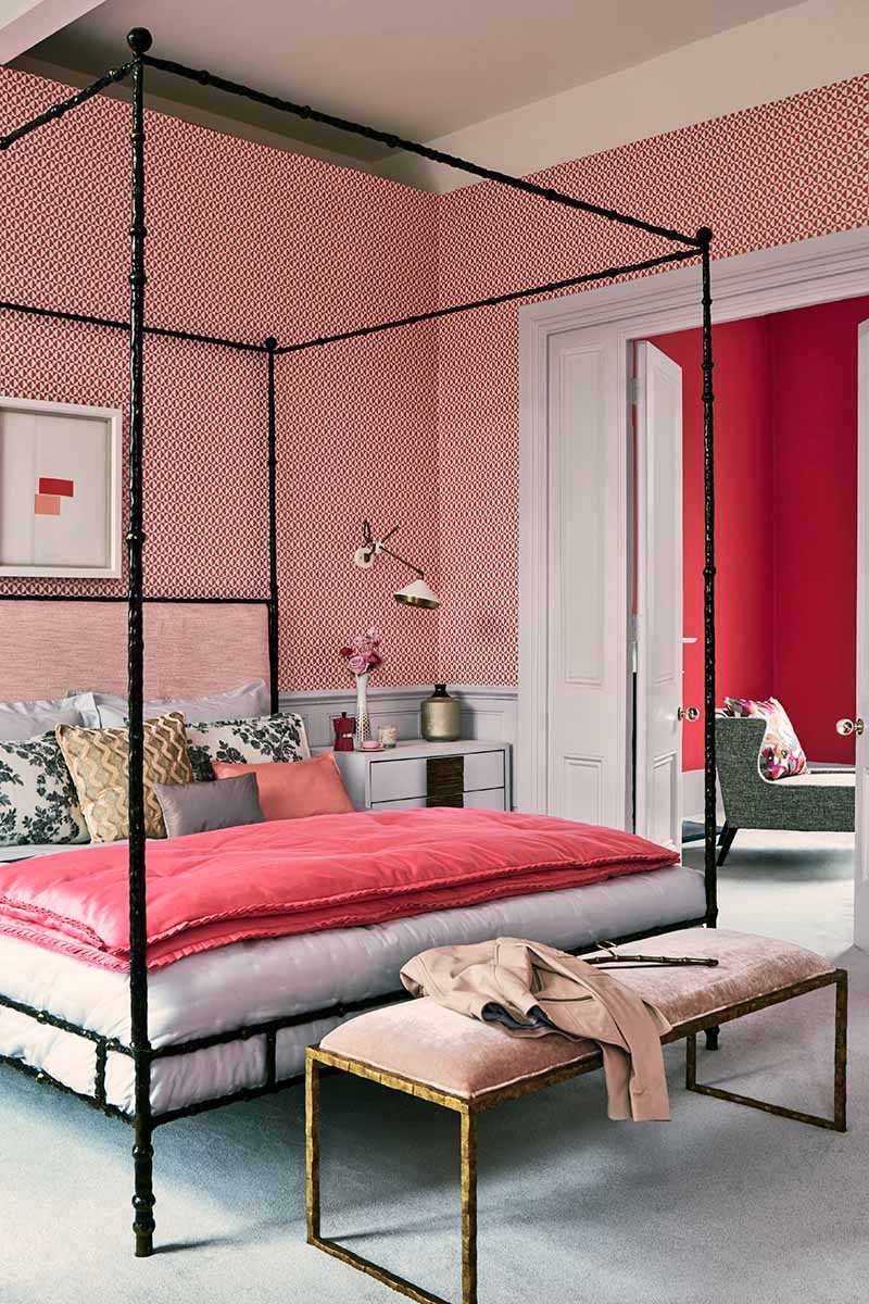
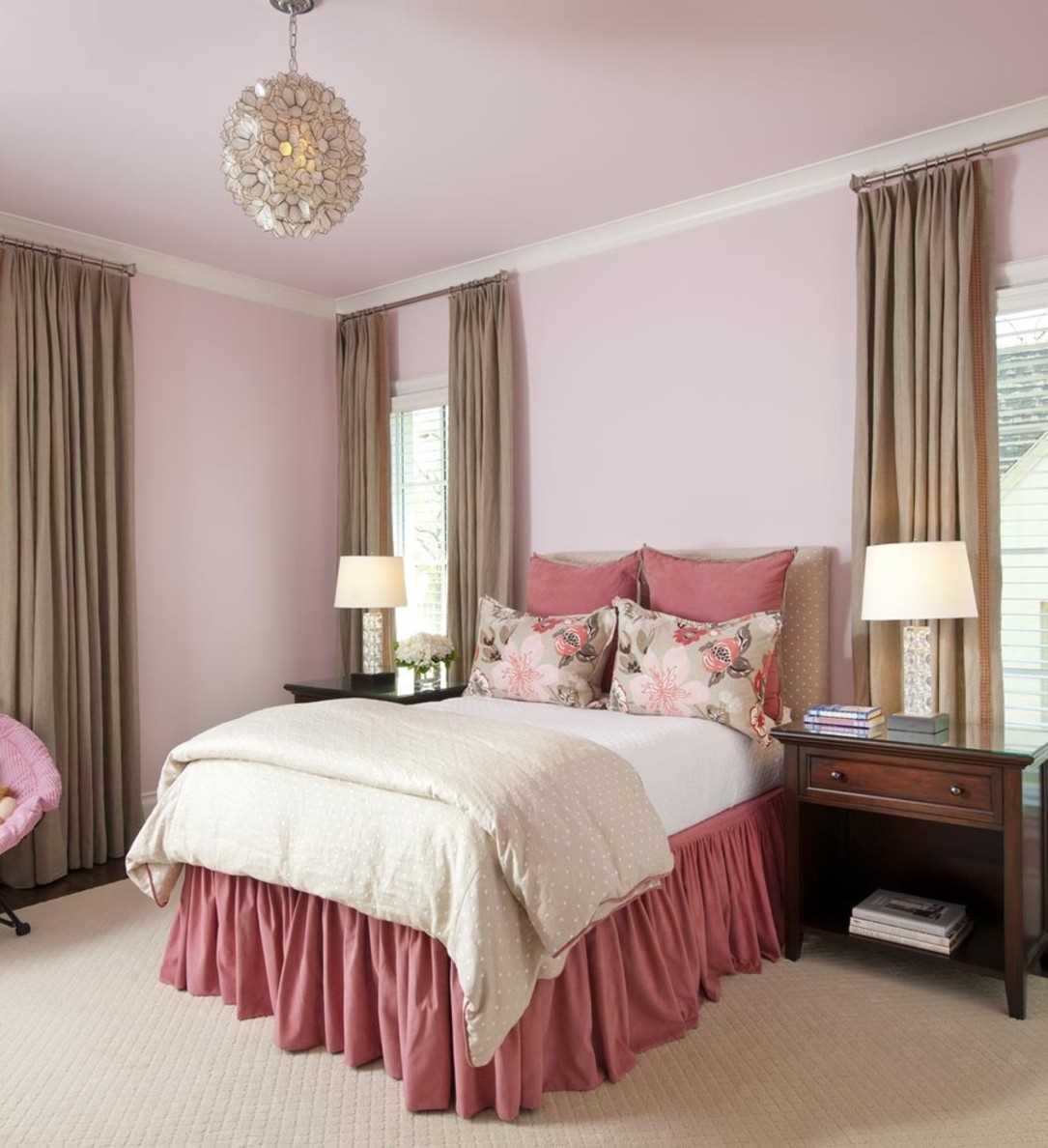
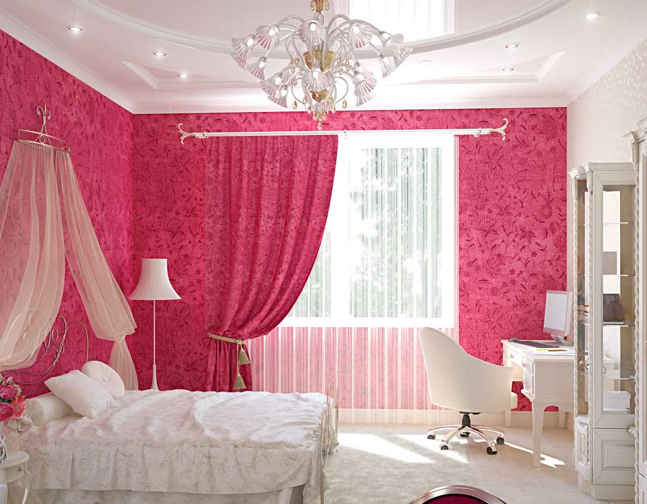
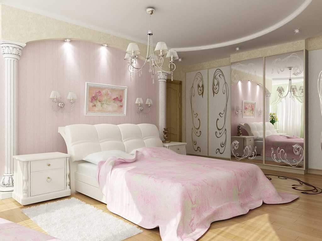
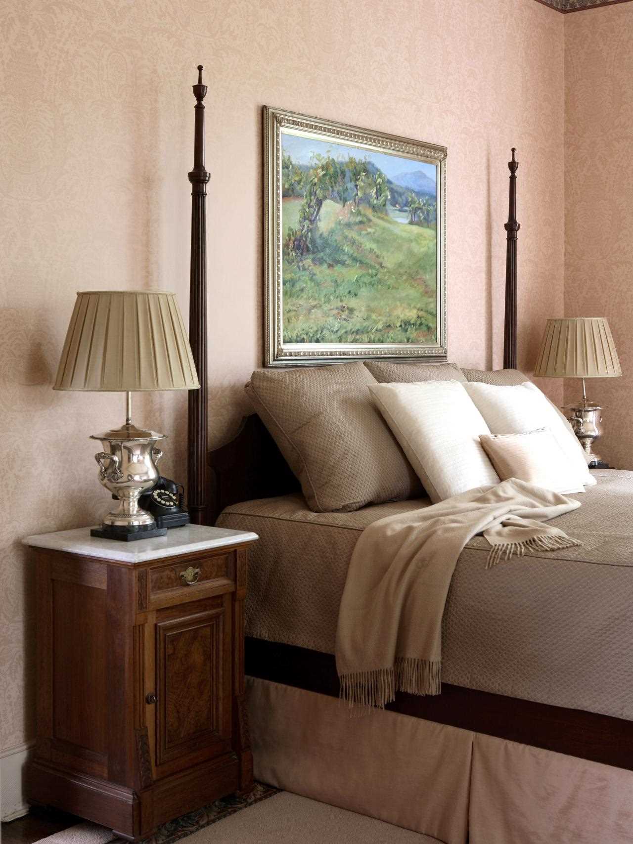
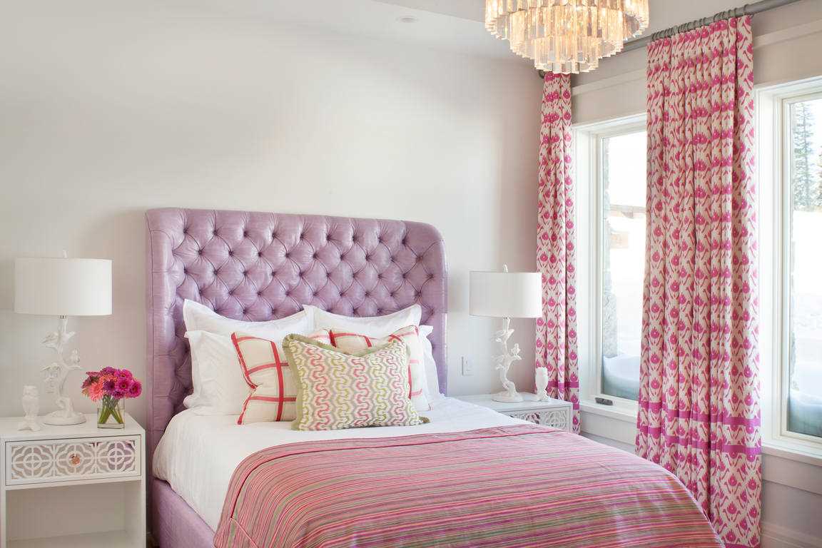
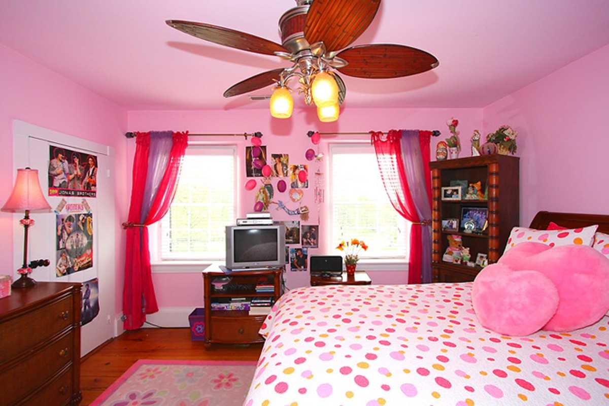
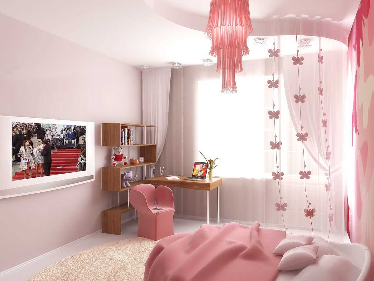
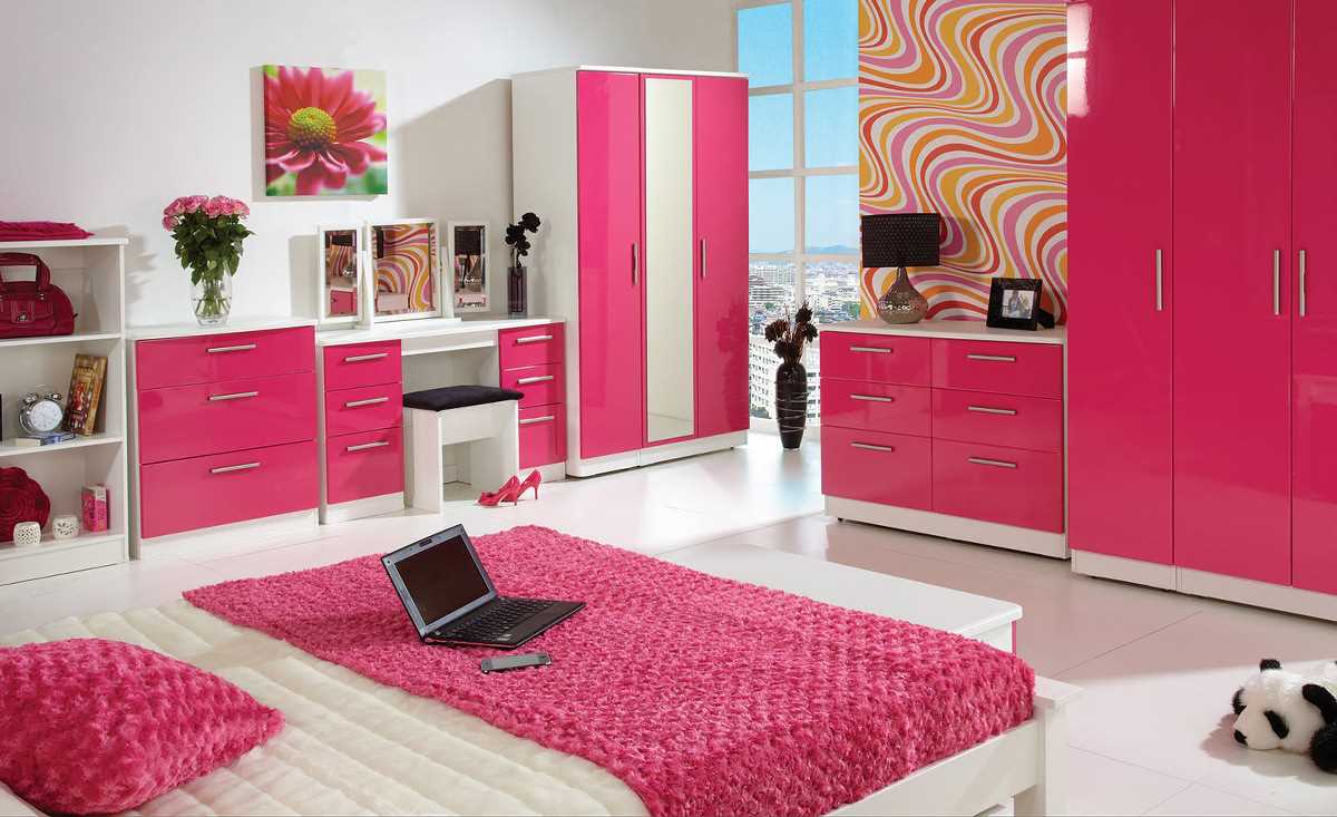
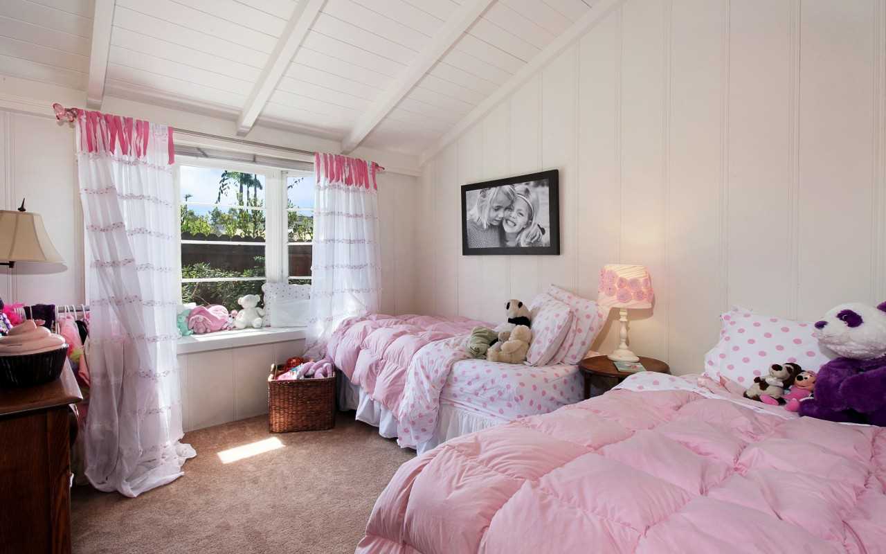
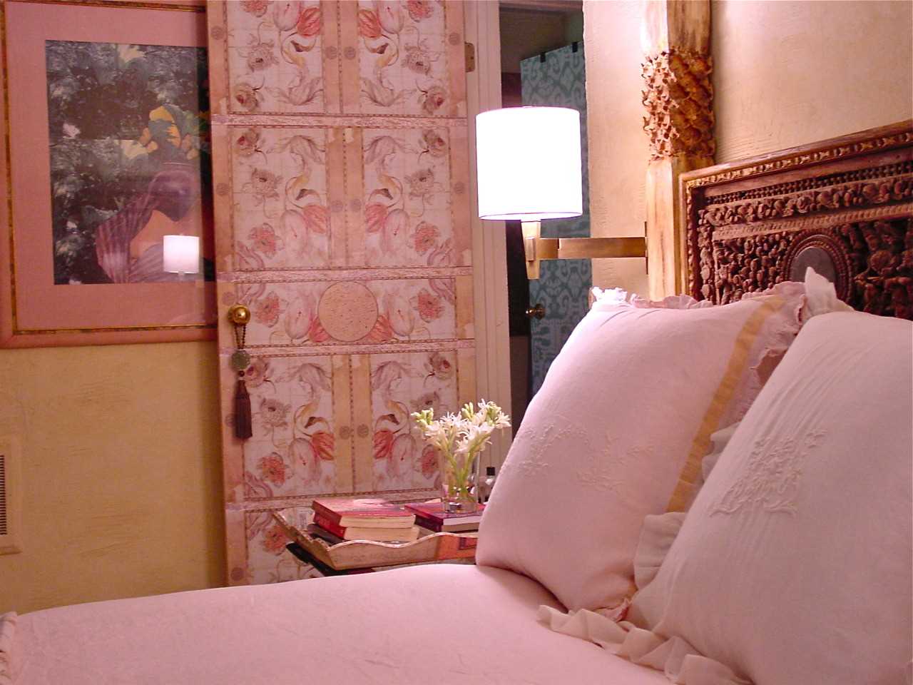
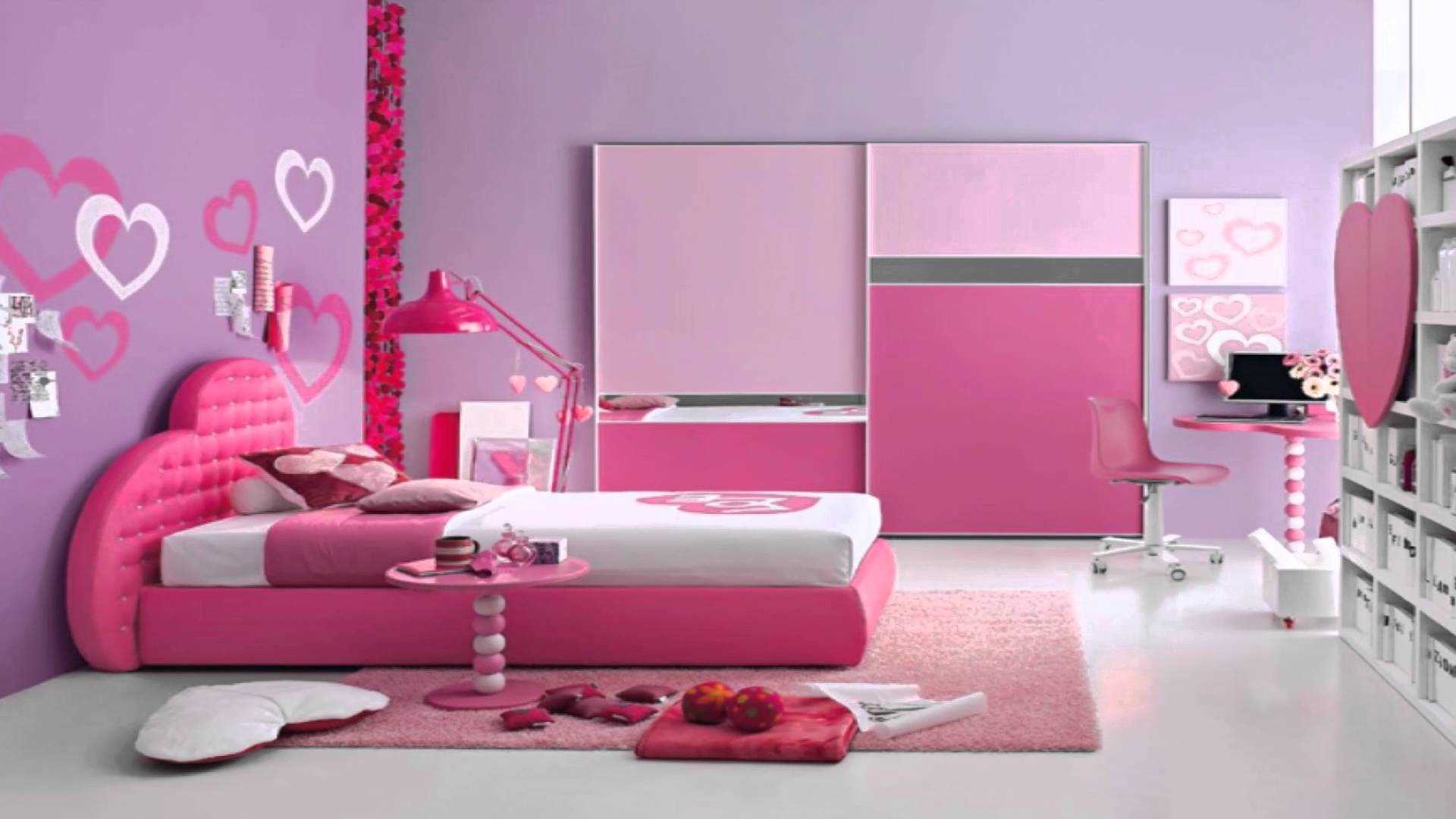
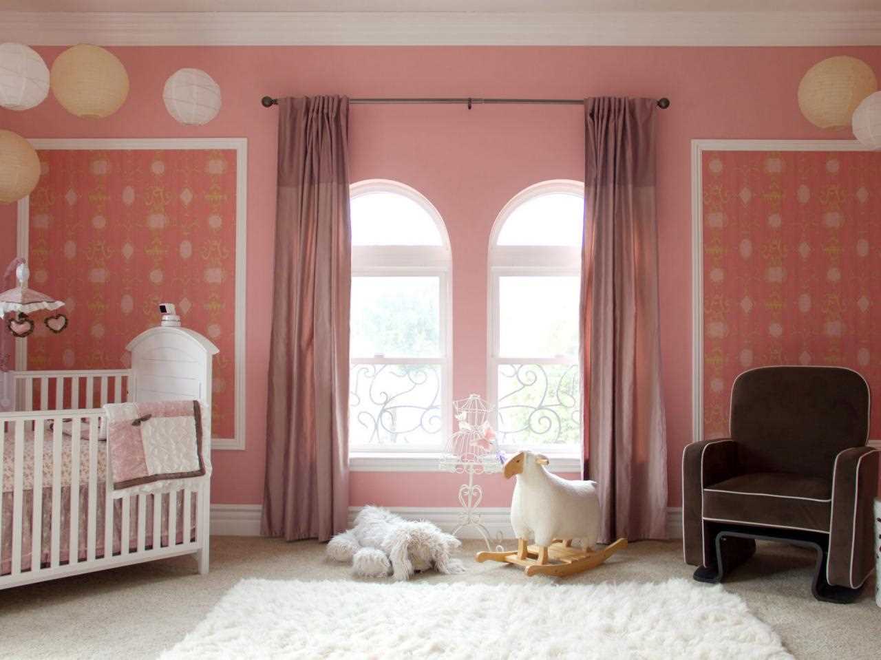
More often this color is used in bedrooms and children's rooms.
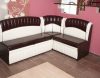
Pink furniture will look very nice
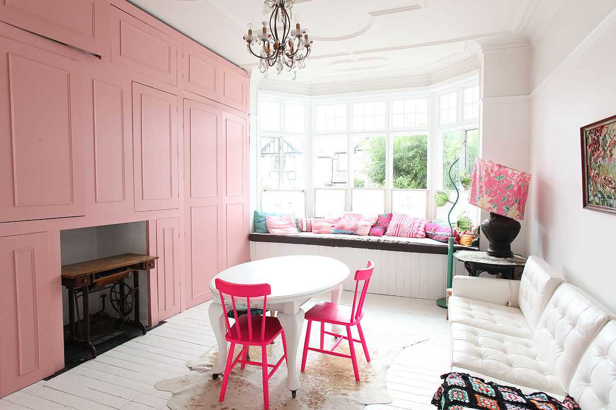
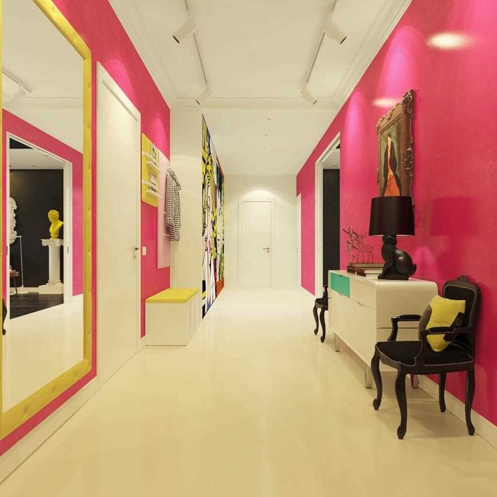
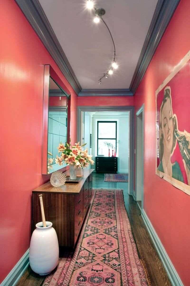
Quite rarely, but pink shades are used in the design of the hallways. It is preferable to work with light or neutral shades. A creative and unexpected solution would be the pink door.
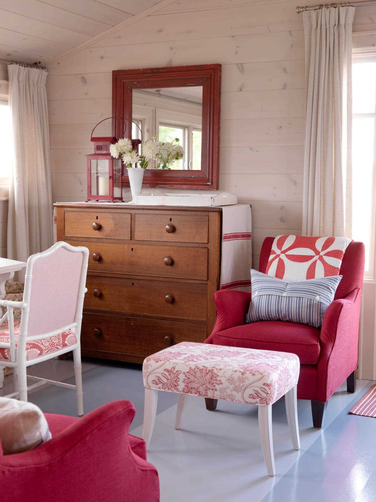
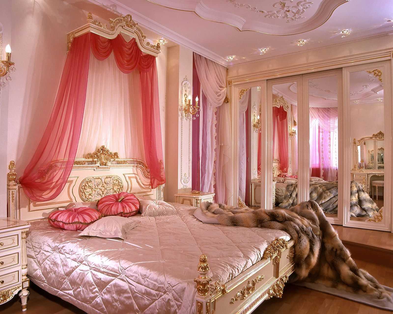
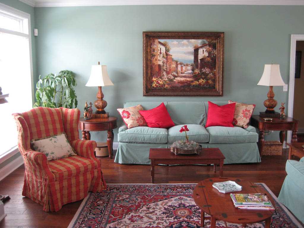
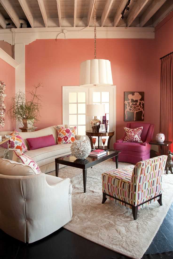
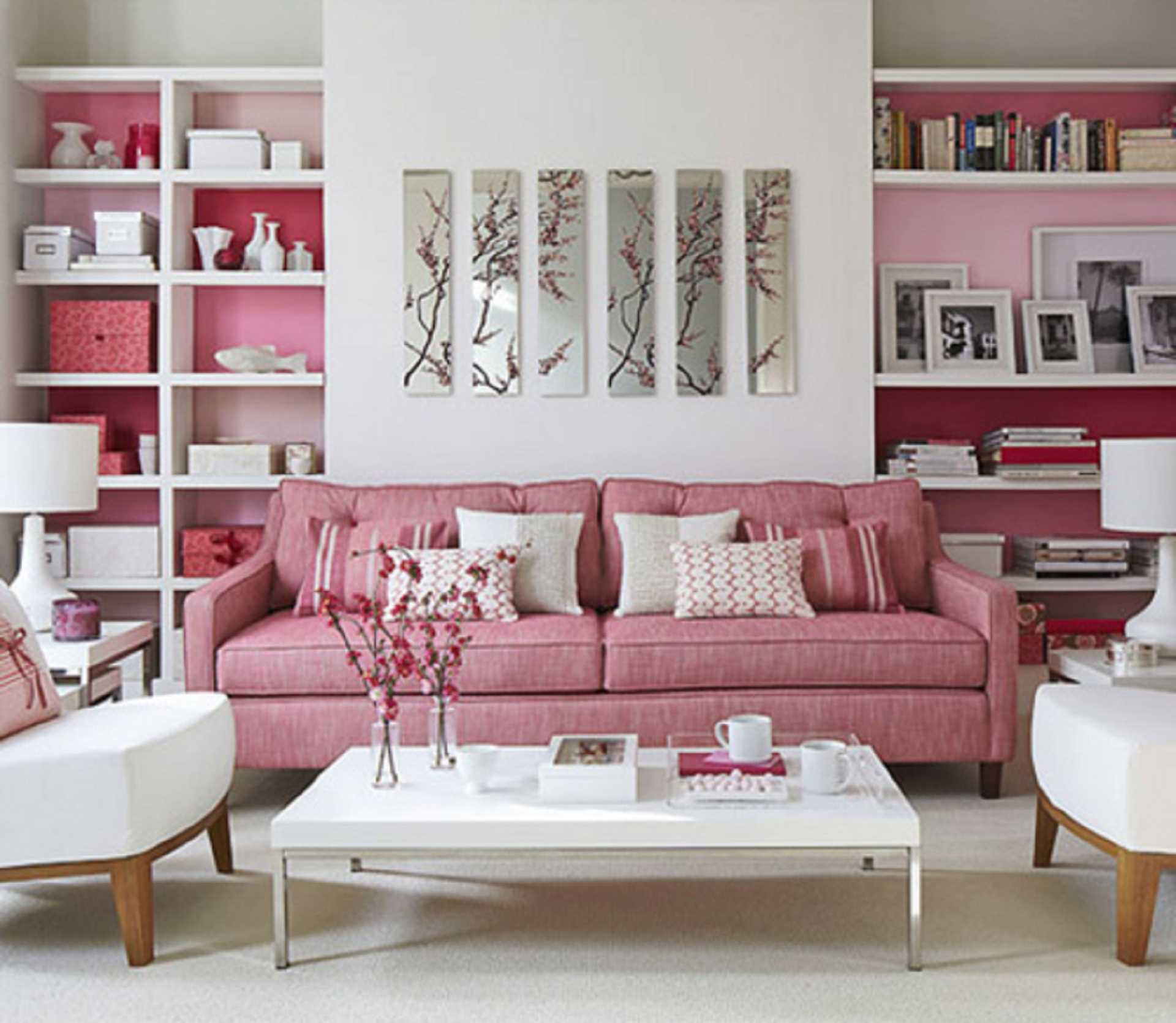
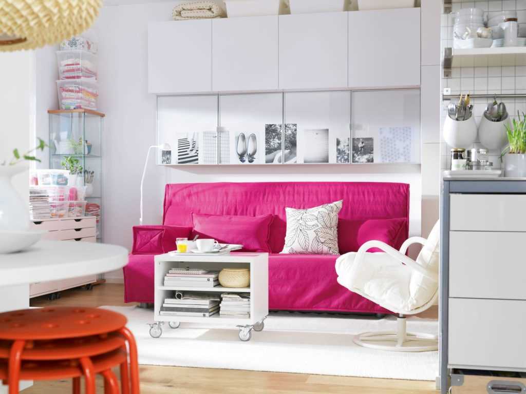
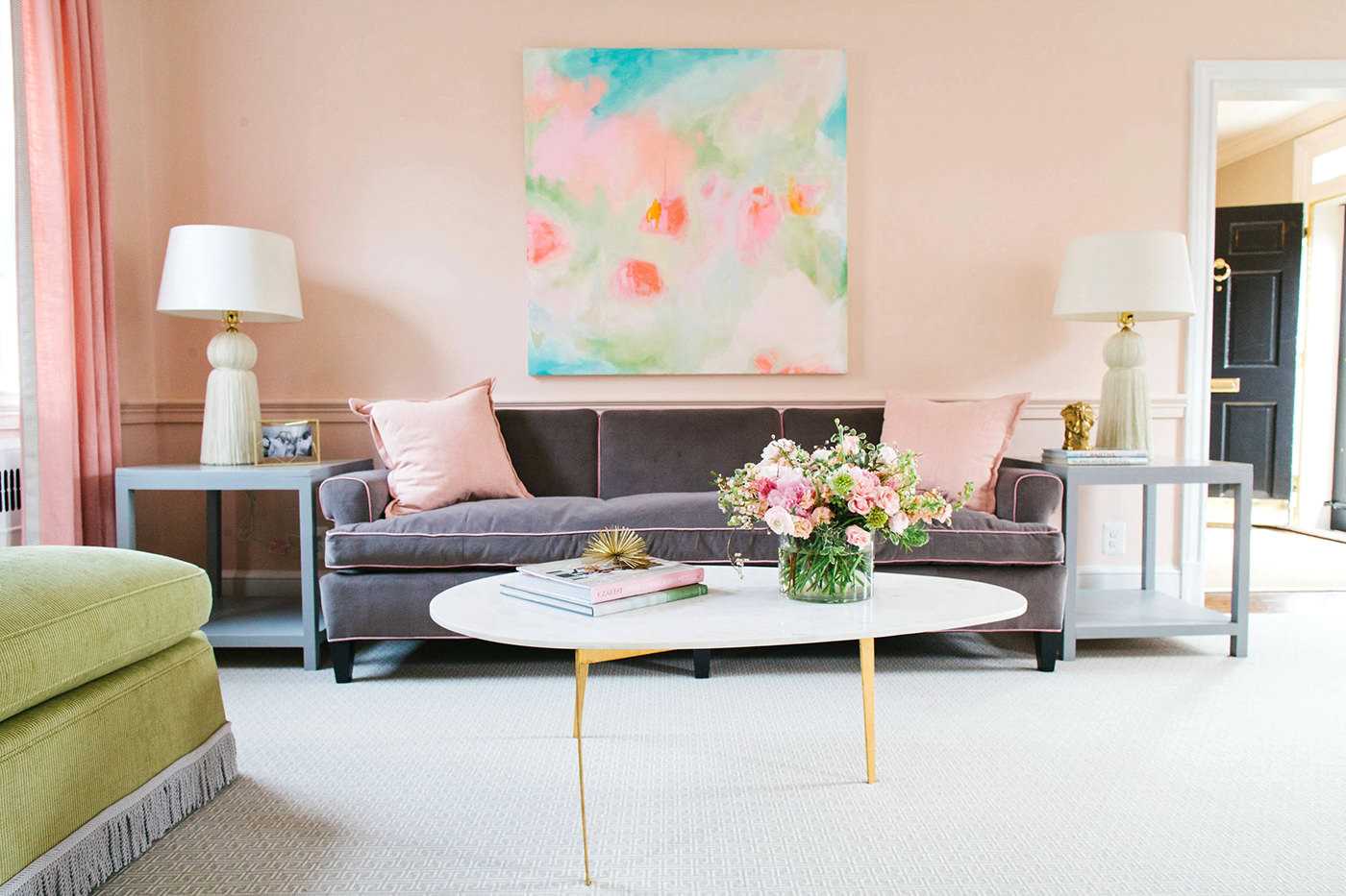
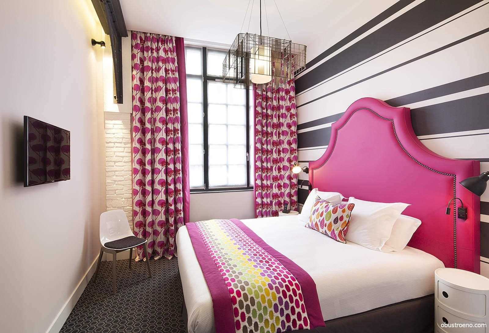
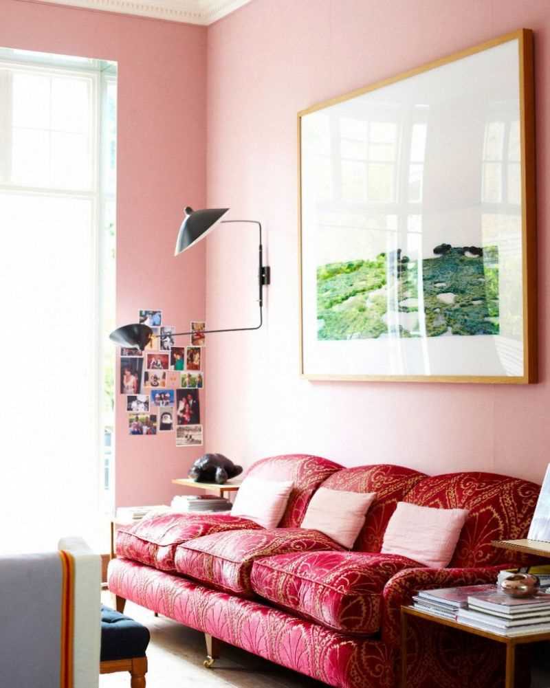
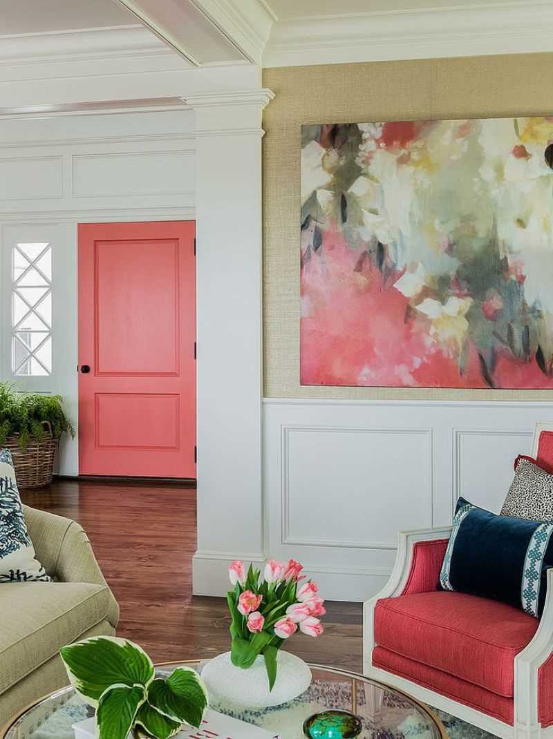
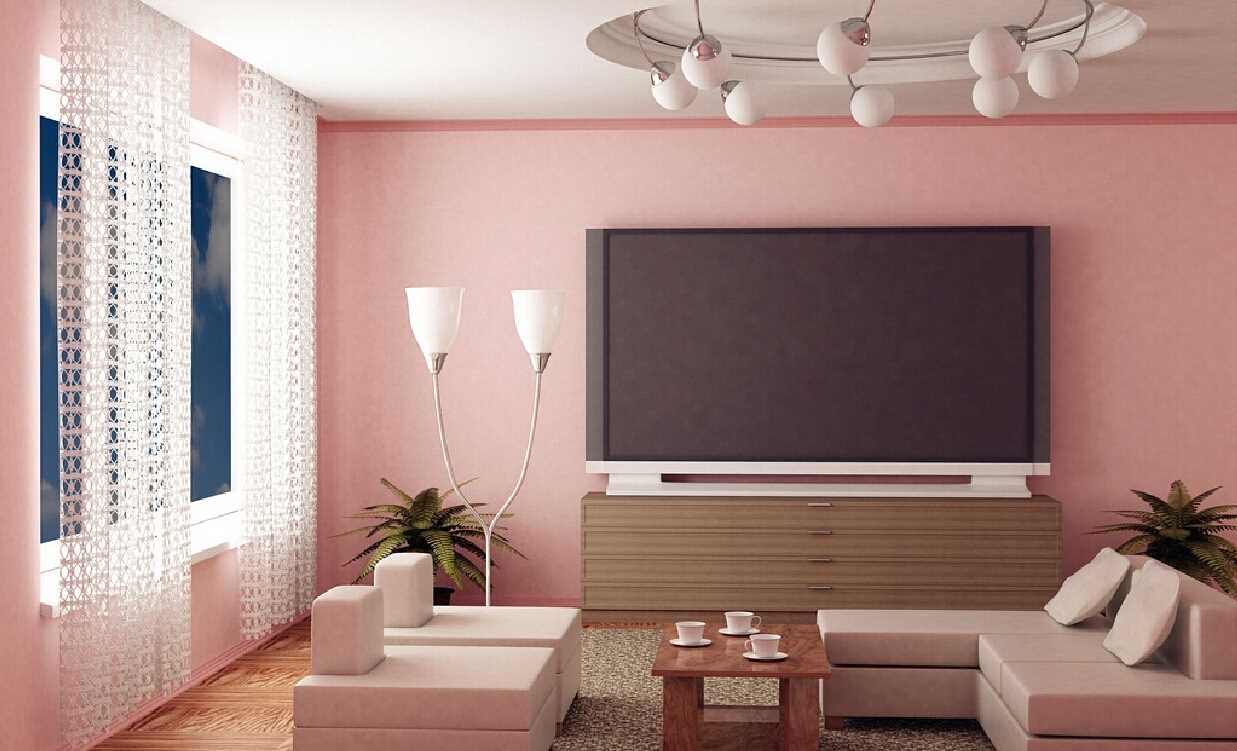
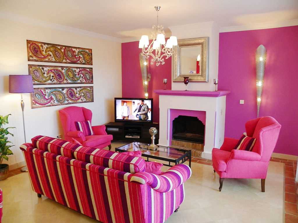
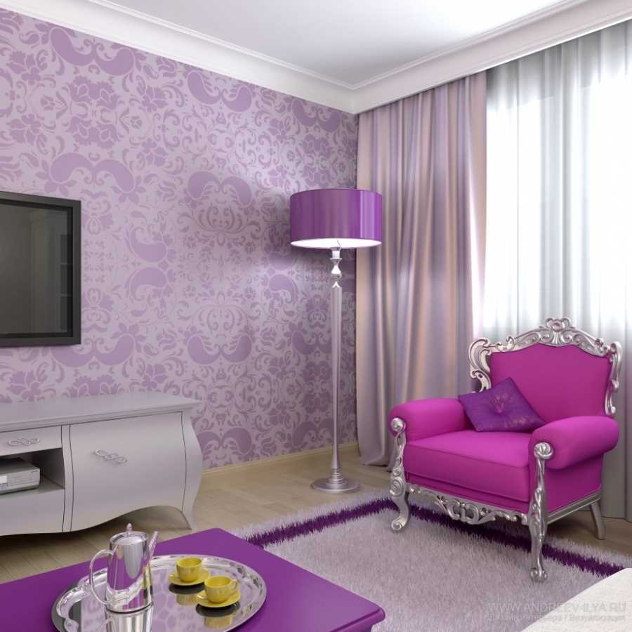
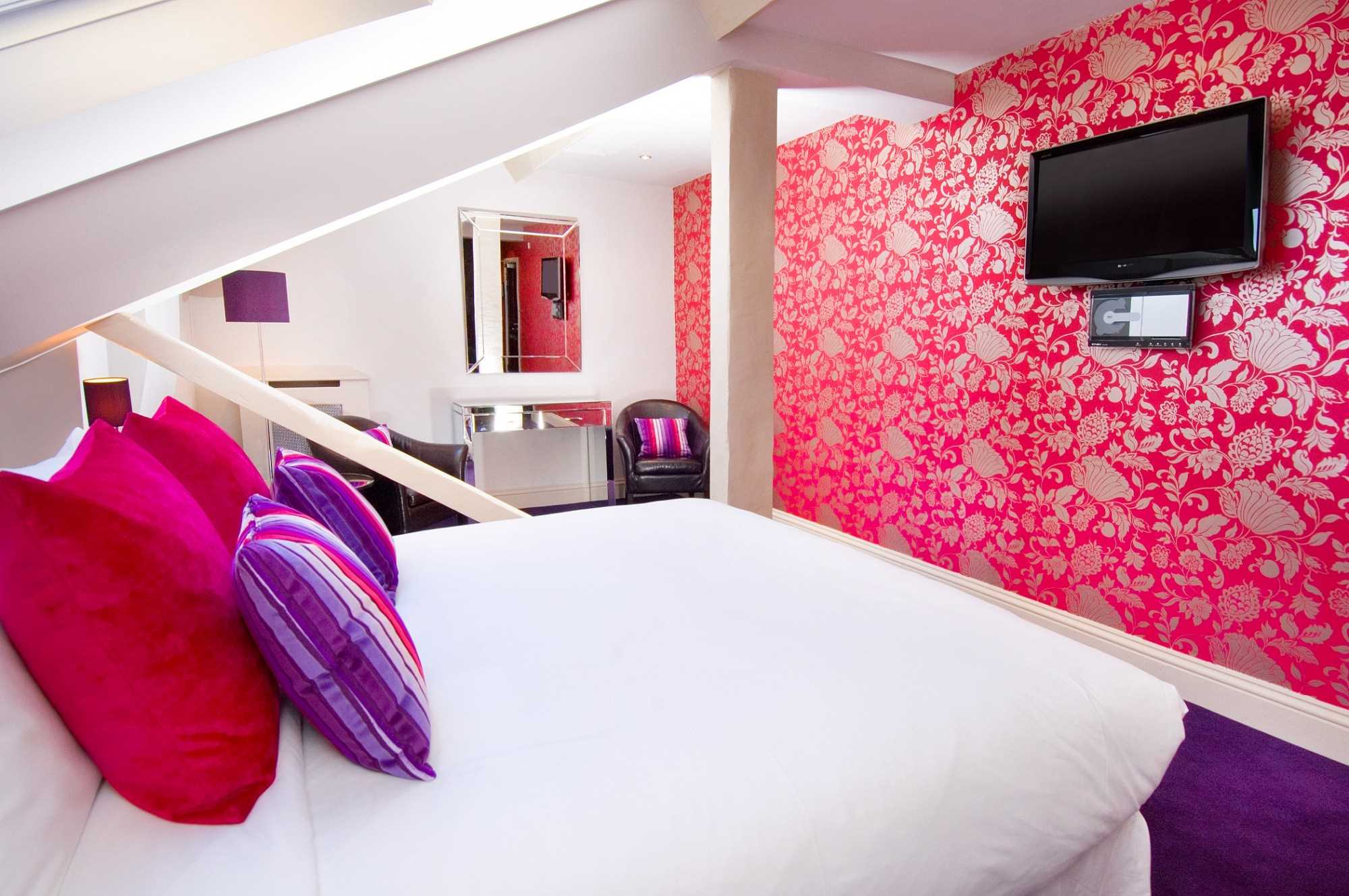
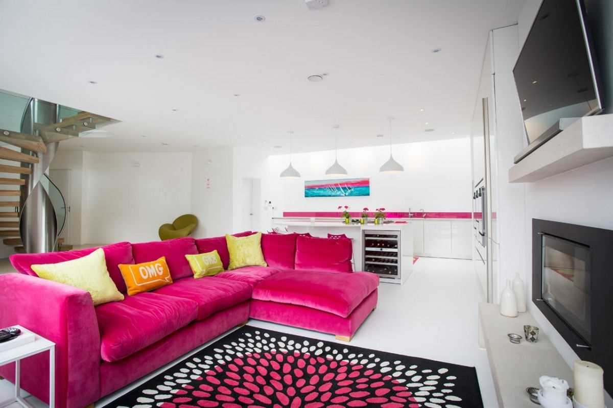
If you want to add pink to the living room or bedroom, you need to understand that it can get bored quite quickly. The living room can be decorated in rich colors, in the bedroom it is preferable to pastel shades. To make the sleeping room cozy, it is not necessary to paint the whole wall or ceiling, a few bright details, for example, a carpet, bedding, a lamp, are enough. In the living room, you can follow the same pattern, choose the color of the upholstery of the sofa and chairs.
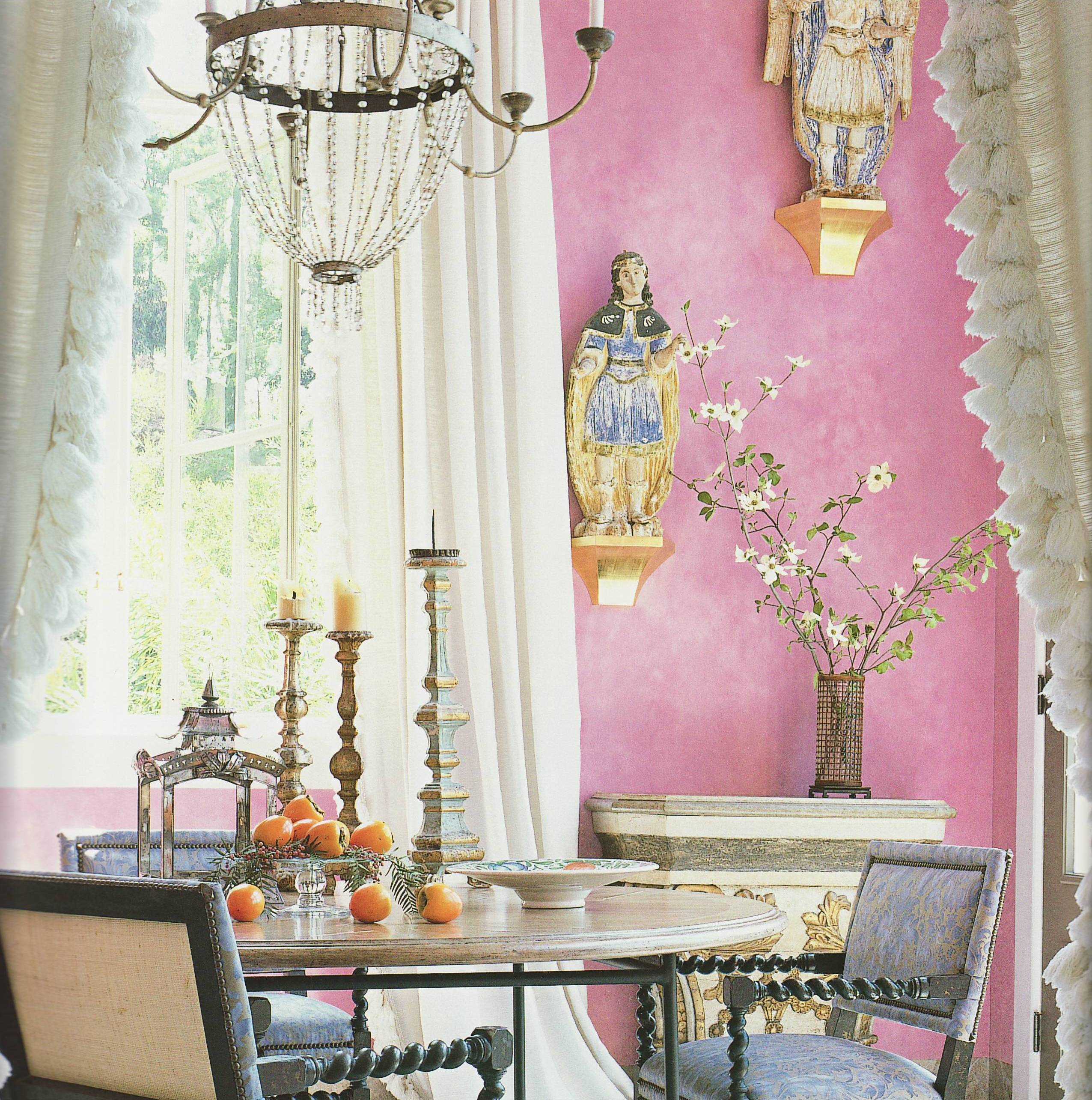
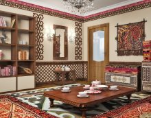
Separately, it should be said about the use of pink in rooms of oriental style. Here, even a large amount of this shade will not look too sweet or puppet. The visual effect will be interpreted differently, refined and sultry.
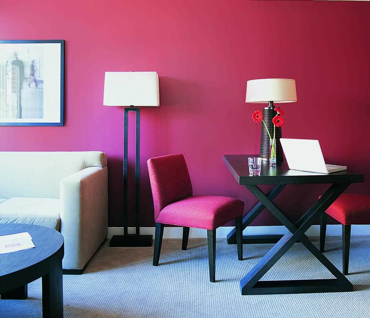
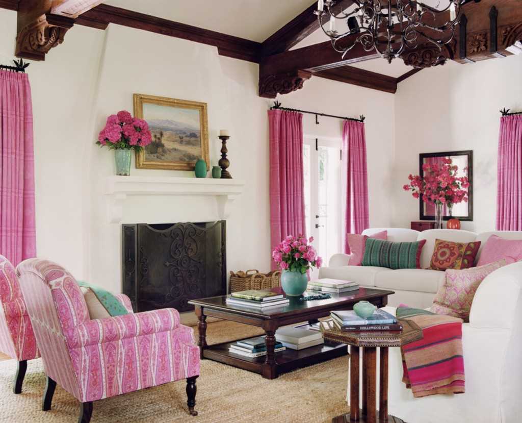
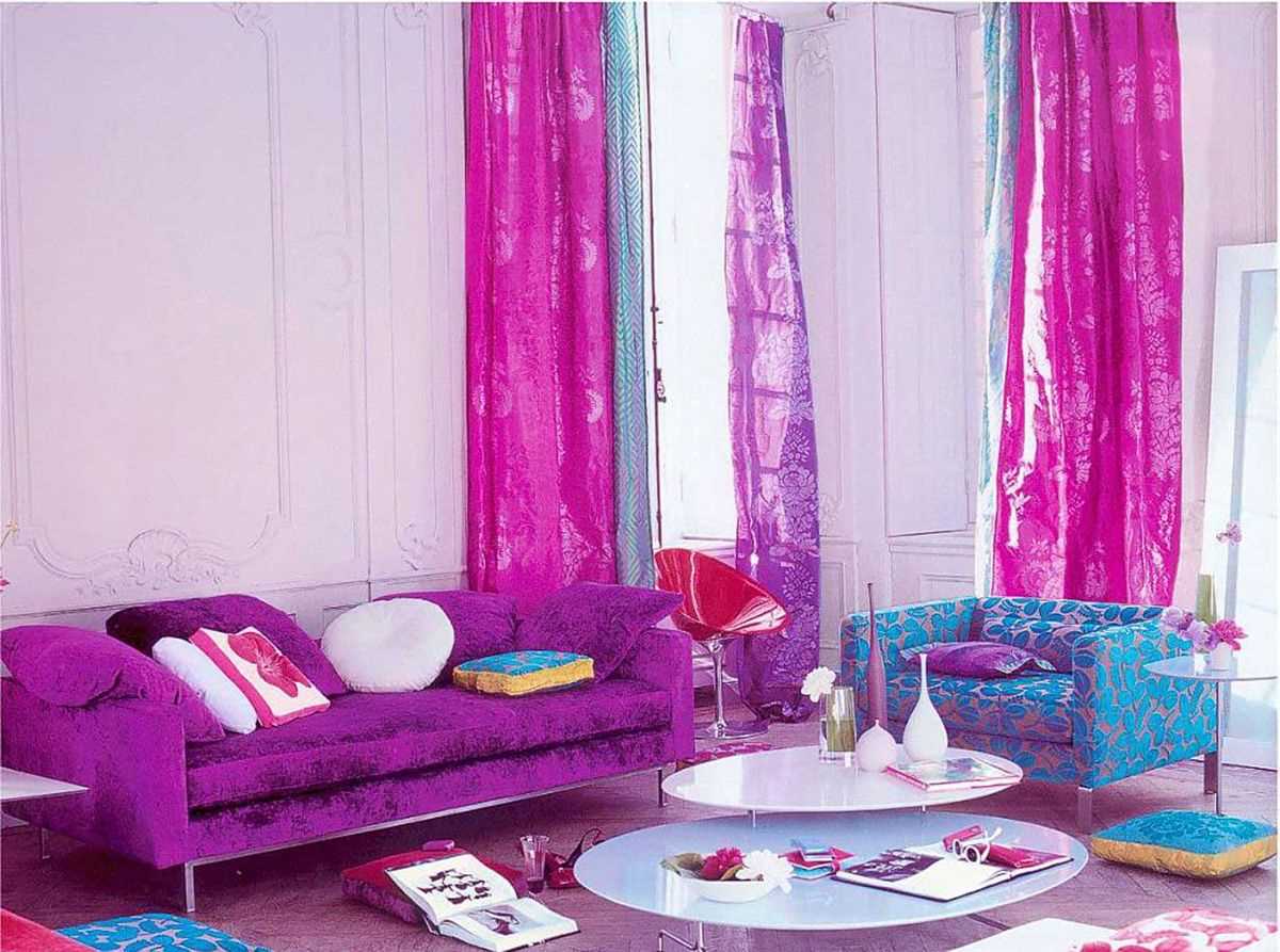
It is better to use bright saturated tones in the living room.
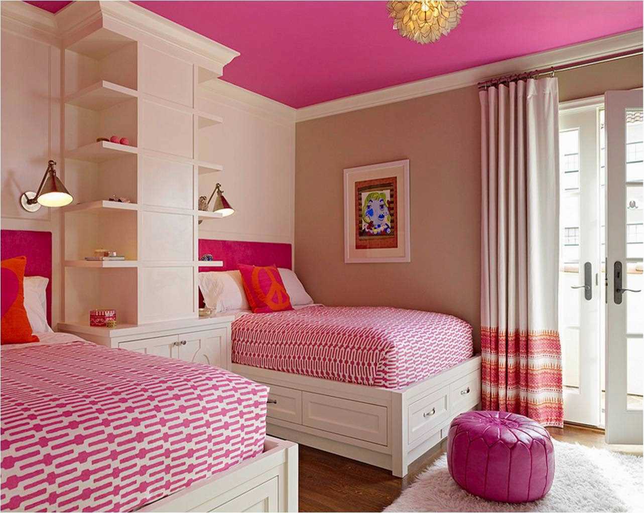
The bedroom for the girl can be decorated in pink
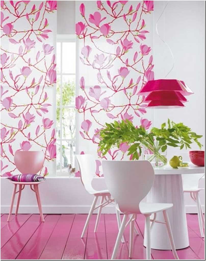
The wooden floor in pink will look very unusual
Pink in the interior is a very multifaceted shade, therefore, with the right selection, it can be combined with any component of the color scheme
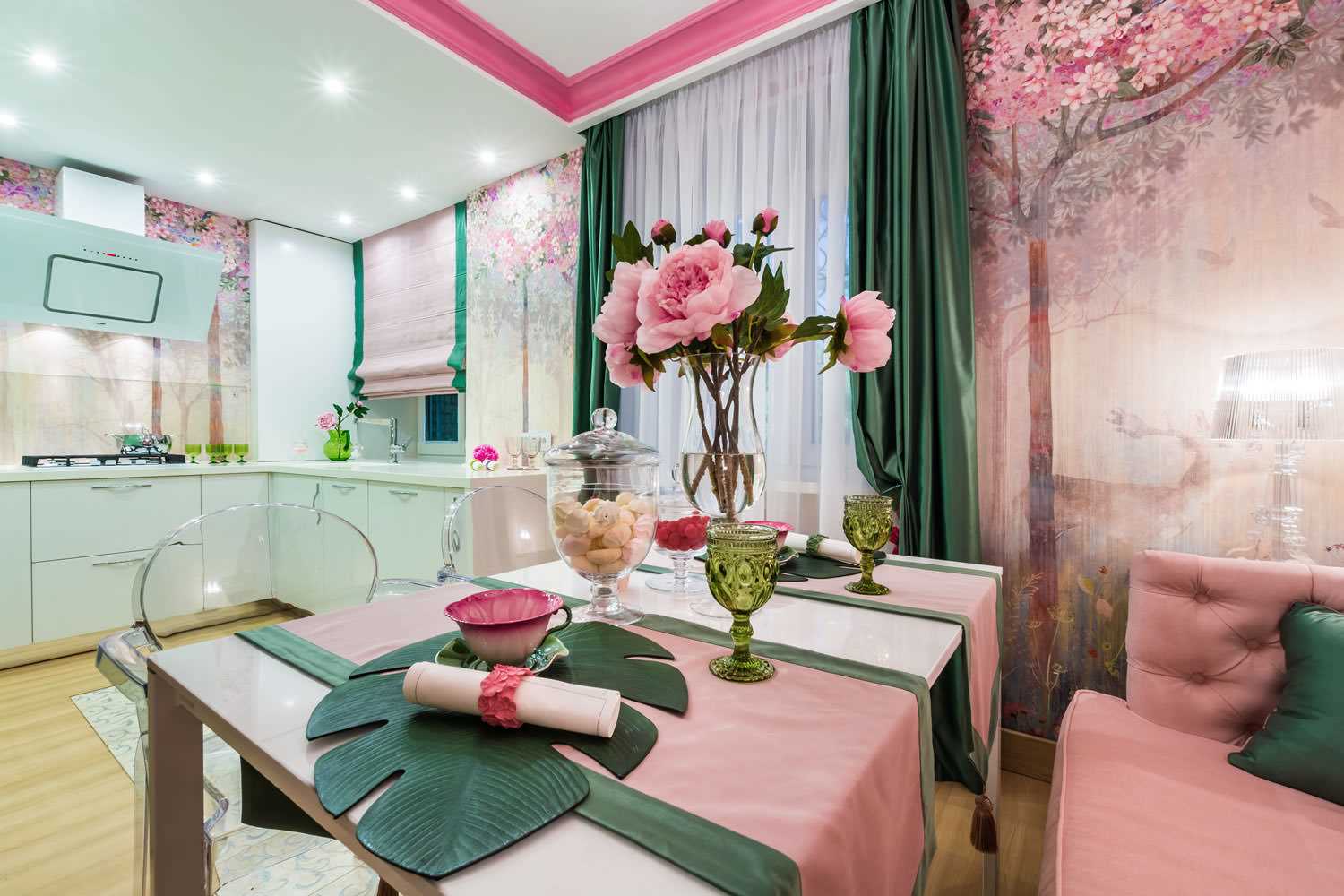
The most beautiful and often used combinations with white, black, brown, yellow, green, gray, beige, turquoise.
Pink color goes with many colors
A pink interior with a dark tree will look very harmonious
|
Pink + yellow
|
A sunny game in contrasts. Great for decorating a nursery, living room. Yellow dilutes pink, makes it less puppet and toy. |
|
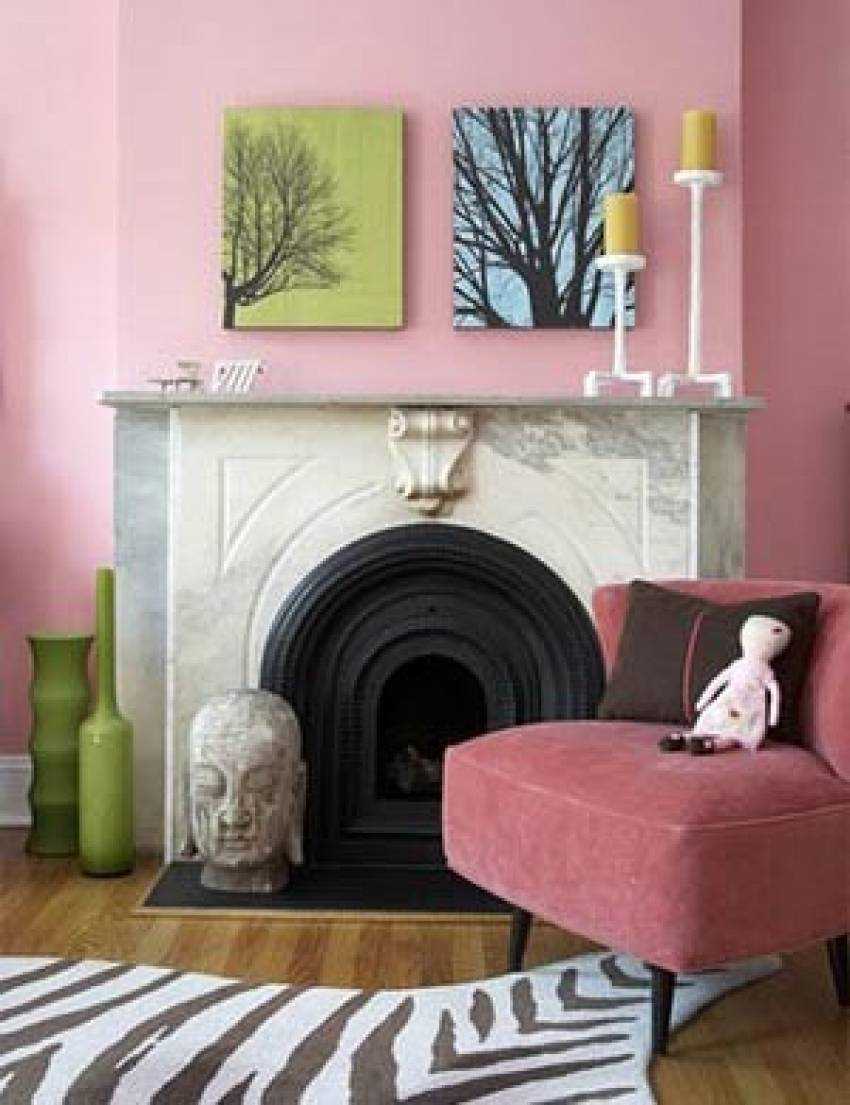
Pink + green
|
A good design option for the living room, dining room, nursery. The design looks very unusual and fresh. It is possible to add an additional, accent color - white. |
|
Pink + Turquoise
|
One of the most popular color combinations in Europe. It is used in the design of nurseries where heterosexual kids live. The interior cheers up, gives a feeling of lightness, fills with energy. It can also be diluted with white, gray. |
|
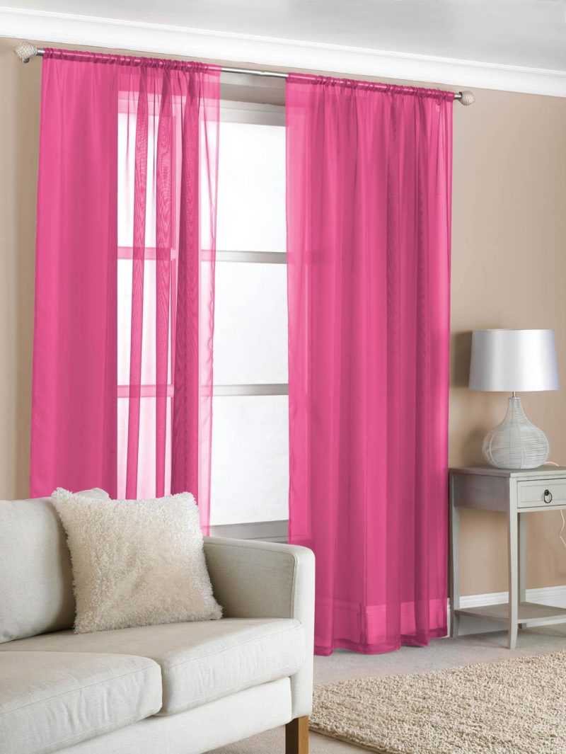
Pink + white
|
Classical combination of shades. Used for baby, bath. So that the contrast is not too “sugary”, it is recommended to dilute it with beige. Better if the tones are warm. |
|
Pink + brown
|
The perfect game in contrast. They remind about ice cream, chocolate. Can be diluted with accents of cream, beige, blue. |
|
Pink + gray |
At the same time restrained, strict and unusual combination. Suitable for living room, bedroom, dining room. Gray is a very noble and calm color that comes alive with pink. It is not necessary to use the latter in the design of walls, ceilings, there will be enough emphasis on accessories. |
|
Pink + beige
|
Delicate combination. In such colors you can decorate the bedroom, children's room, living room. The interior of the room will soothe, create the impression of comfort and warmth. |
|
Pink + blue
|
Unusual combination. Most individuals are accustomed to a clear distinction between these colors by gender. It is used mainly by young designers and is not mistaken. The room looks unusual, bright, fresh. The unusual color combination makes it even more creative. |
|
Pink + black
|
The perfect combination. Black dissolves pink, makes it more rigid, brutal. |
Pink color in the interior will create a special atmosphere
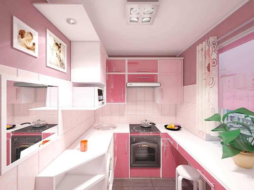
The pink kitchen will look more spacious
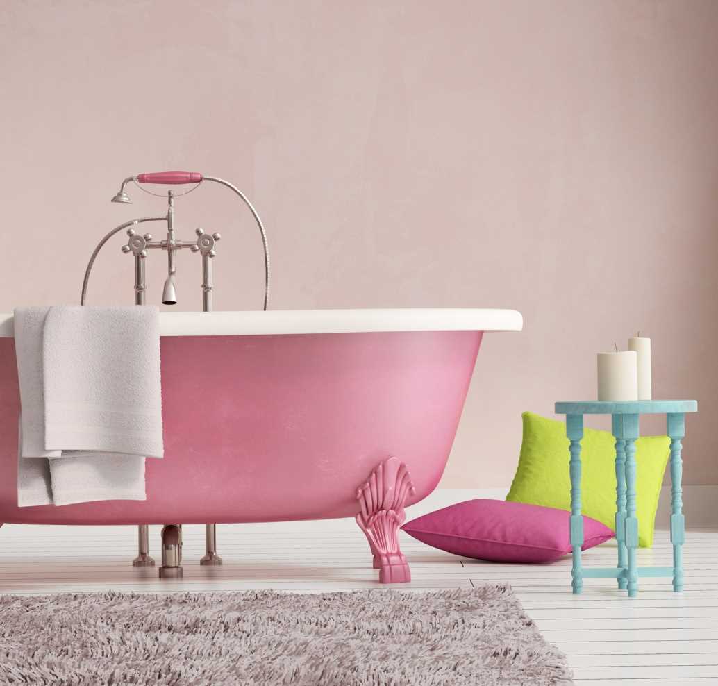
For the bathroom, pink is very rarely used.
Despite the fact that pink is almost a universal color, there are limitations for it.
Do not try to combine the above color with red. Pink can be called its derivative, they are quite similar in hue and perception. The result of the combination can be more annoying than pleasing to the eye.
It is not necessary to paint large sizes in pink. The result will be the opposite - the interior will quickly get bored. Even if one of the walls is completely pink, it is recommended to hang a dilution element on it: a picture, a lamp, a photo.
Do not overlay color on color. For example, if the furniture is pink, you should not buy textiles of the same color on it. Or pick up a carpet or curtains to the pink ceiling.
To choose the right color, you can seek help from specialists
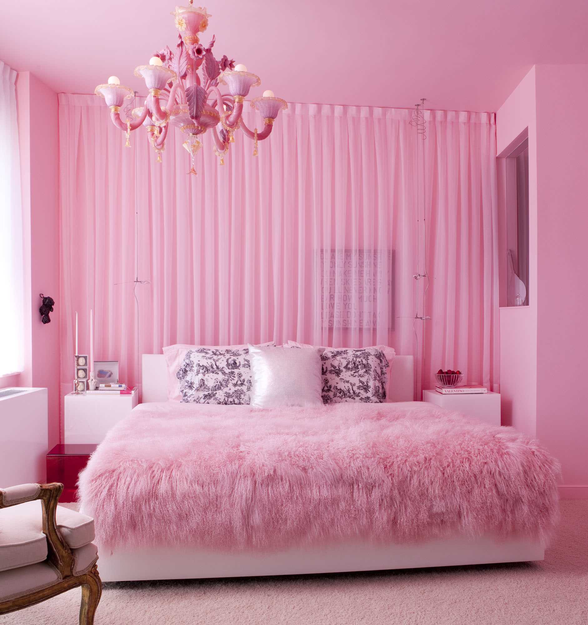
The bedroom in pink is more suitable for girls
You should not introduce pink tones into the room where people with high blood pressure live or periodically are. It can act on them exciting, thereby irritating the nervous system, teaching the heartbeat.
Pink color is beautiful in all combinations. But, use it must be metered. Most interior designers believe that the larger the staining area, the lighter and more neutral the shade should be. You need to work with bright, saturated tones of pink very carefully. Do not be afraid to experiment, but it is better to think over options for correcting the situation in advance.


Thank!
In the near future we will publish information.