
75 photos
Most people try to surround themselves with beautiful and high-quality things. This also applies to design ...
What first comes to mind when mentioning the word "mint"? Of course, freshness. And this association concerns not only the plant itself or fragrant teas with its addition. Peppermint produces a similar visual effect with its complex, ambiguous color. A pleasant, greenish-blue hue, sometimes diluted with an admixture of light ash notes, gives a feeling of coolness due to the light menthol chill that it exudes. It is precisely because of these unique qualities that the mint color is so widespread in fashion and interior design.
The mint color in the interior is associated with associations of freshness and coolness arising from its perception
Content
Since 2012, the mint color holds the unshakable position of the leader of the fashionable palette. Shades of menthol can be different - very light, pastel and deep, saturated. There are an infinite number of them, they are called differently. Almost every year, beloved by many, the greenish-blue halftone is replenished with new variations that are given romantic and fantasy names.
With a reasonable approach and the optimal selection of “neighbors”, a mint shade can completely transform the room
One version of the palette is as follows:
Mint color combinations
On the Internet, you can easily find countless combinations of tables of this cooling color. Among them are professional pallets from the world famous expert Pantone. With their help, you can easily pick up the perfect shades of mint that are right for you. But when choosing a suitable option, it is important to know about its compatibility with the rest of the palette. Despite its softness and calmness, mint does not harmonize with all tones.
An interesting feature is the mint color. Almost all light shades are suitable for him. Depending on his companion in terms of the palette, he sounds new every time, acquires a special character, but remains the same self-sufficient.
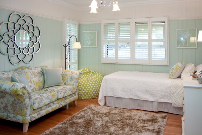
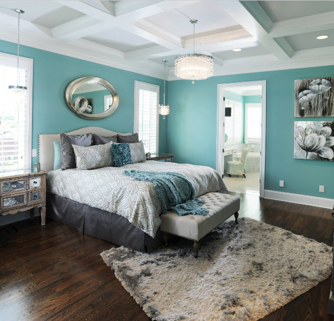
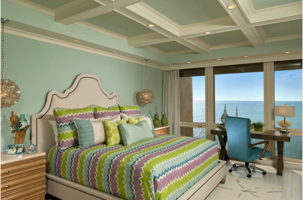
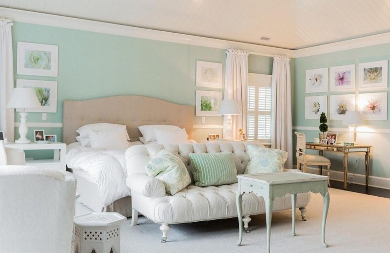
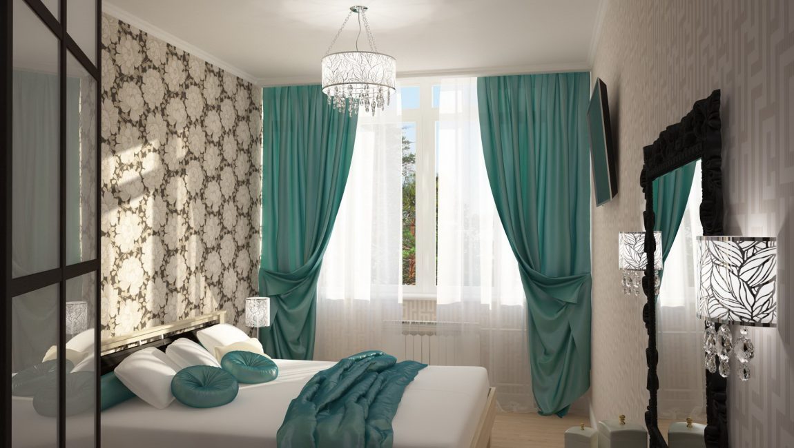
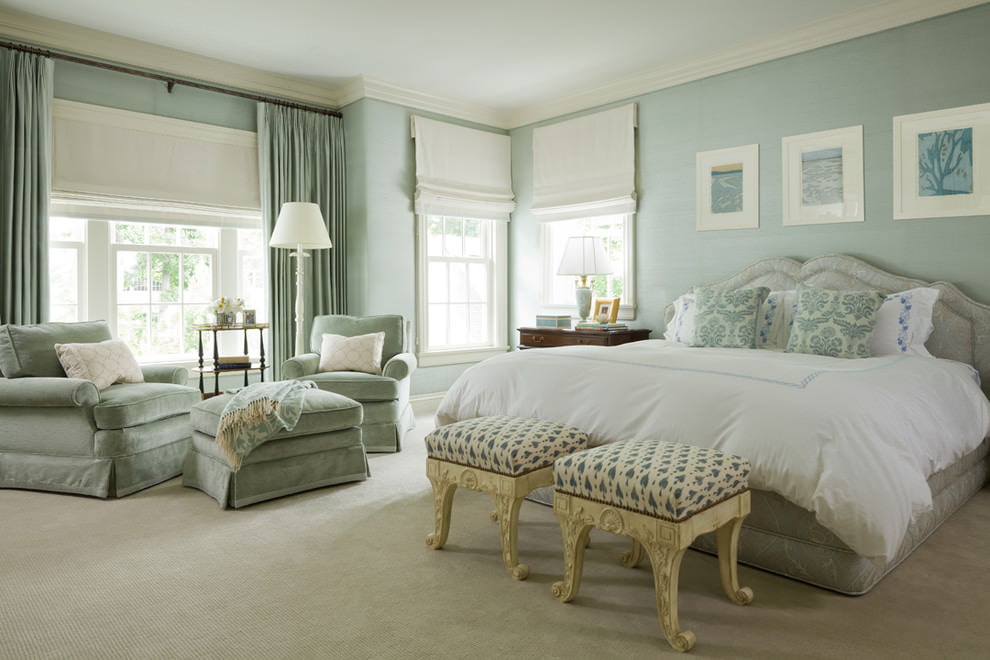
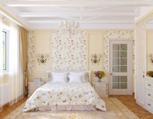
Cozy bedroom in bright colors
Calm color palette pleasing to the human eye
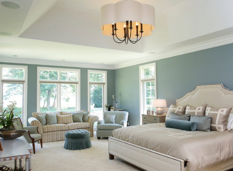
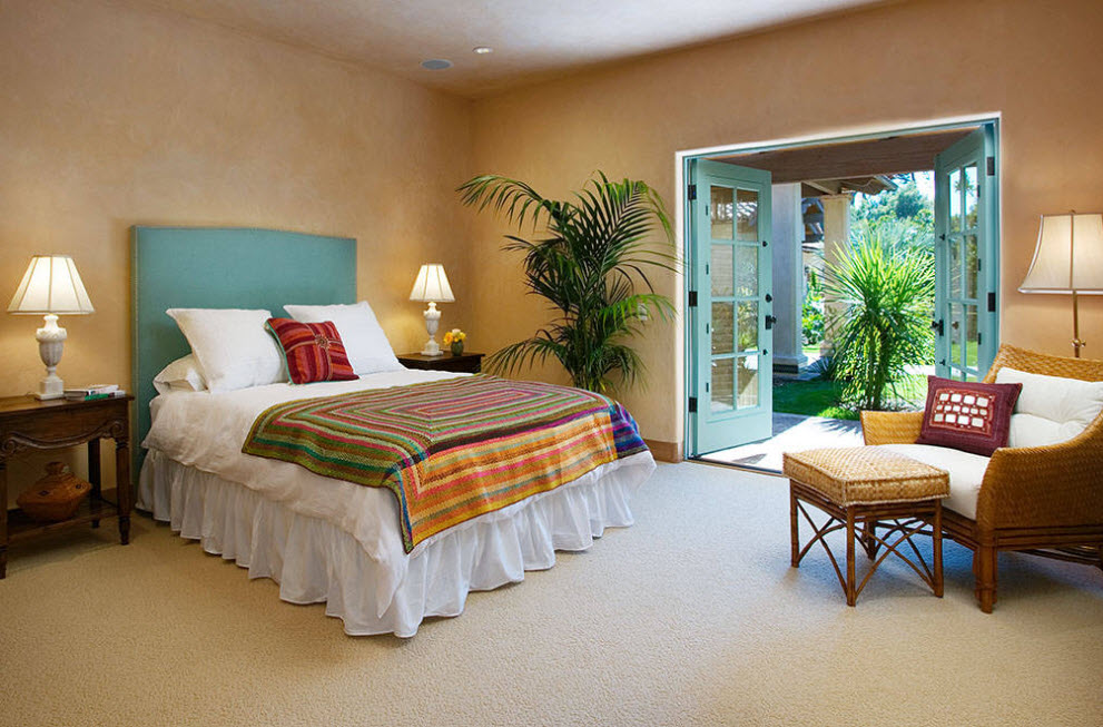
A reference combination to create a luxurious and light summer look.These two noble companions form a rather aristocratic tandem that gives visual freshness. It is advisable not to spoil the impression and not add any other tones. The only exception can be made for golden or silver blotches. From this combination of menthol and snow-white will become even more refined.
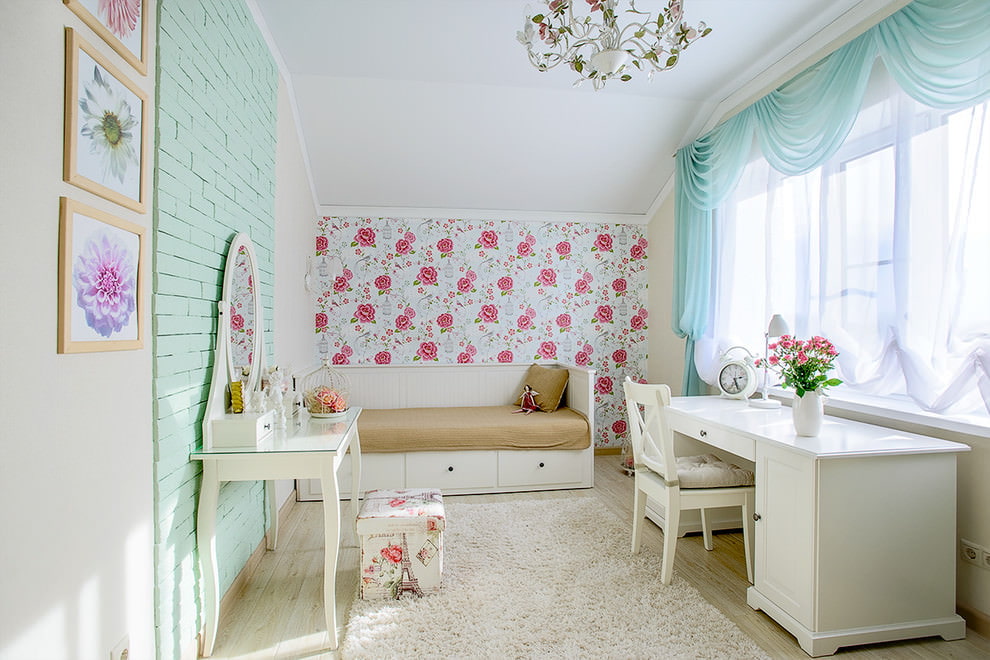
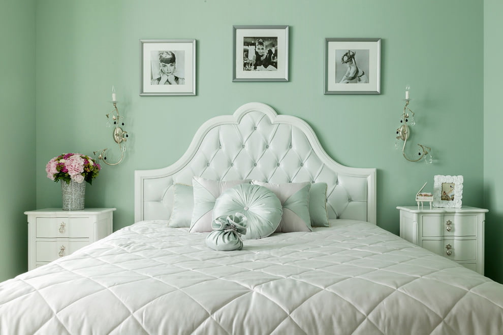
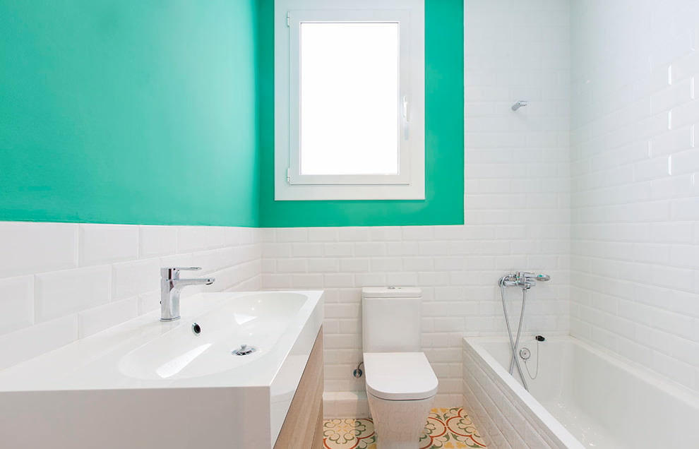
The universal combination of mint color with white is suitable for any interior
The combination of white + mint will create the impression of spaciousness even in a small room
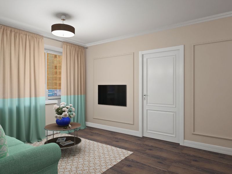
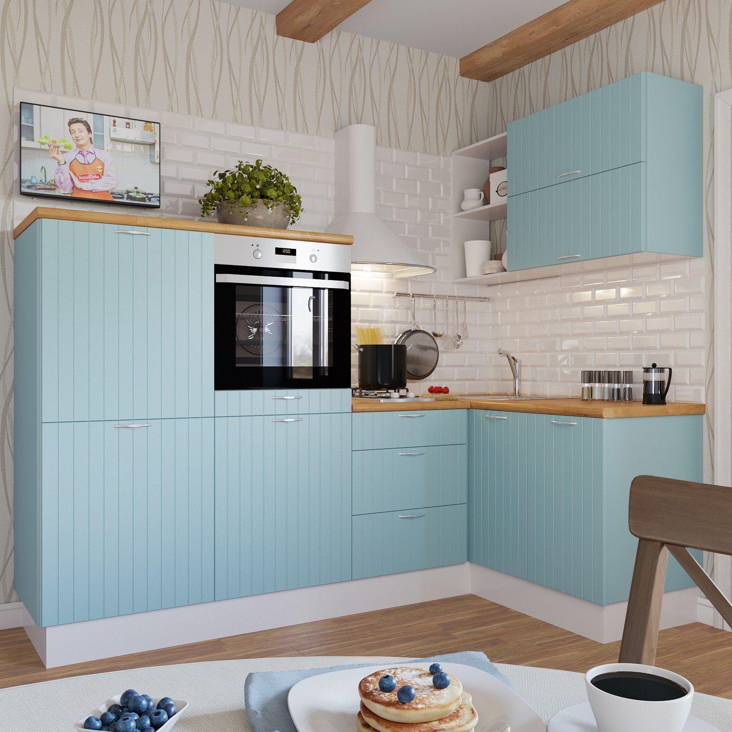
The union with beige makes the mint color more solid and mature. But if you do not add other shades to it, he risks becoming boring and inexpressive. Therefore, this combination of colors must be diluted with white additions. Additional companions may be golden or silver, but they should be present in minimal quantities.
All shades of beige blend perfectly with mint tones.
It is important to know: If a dark brown or chocolate tone is chosen for the tandem, then the menthol should be saturated in content.
The classic combination of mint, beige and brown.
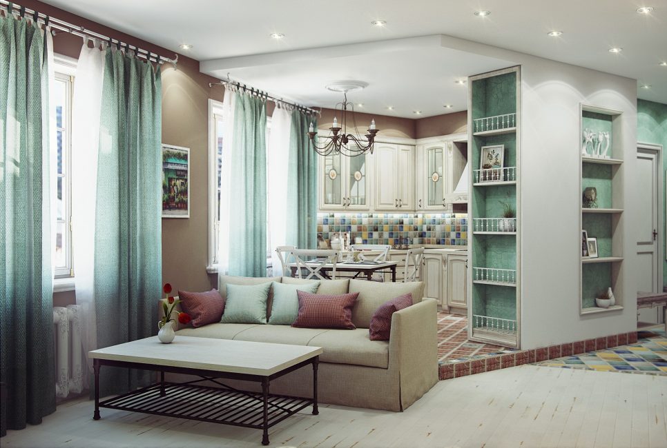
The combination of warm and cold colors allows you to create an original image of the room
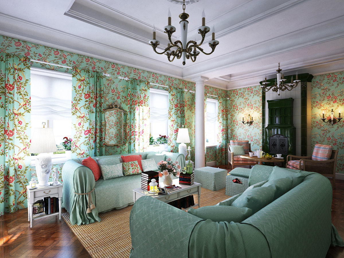
No less successful alternative to light tones will be any shades of pastel colors. They form the perfect combination of colors with a mint tone, because he himself belongs to this delicate, blurry palette. And again, thanks to pastel tones, it sounds new every time.
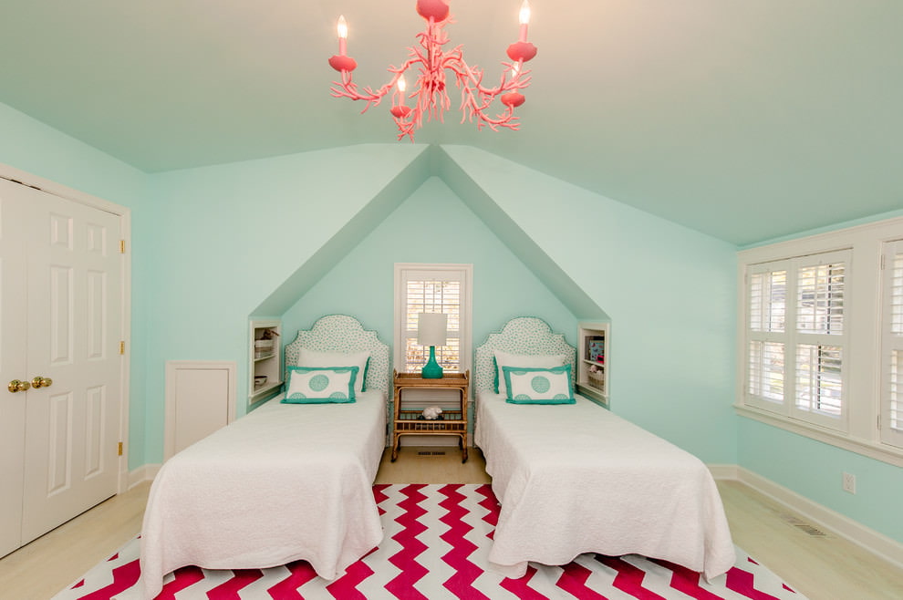
The mint pink combination is perfect for a room in the style of shabby chic or provence
The combination of mint and lilac colors is ideal for a bedroom in pastel colors.
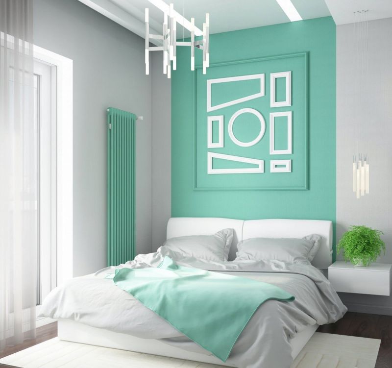
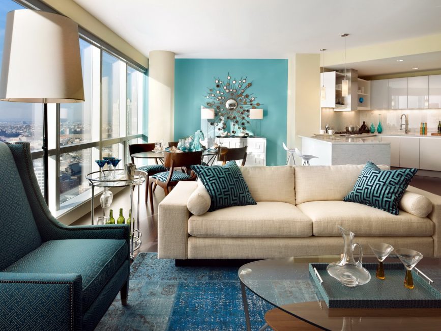
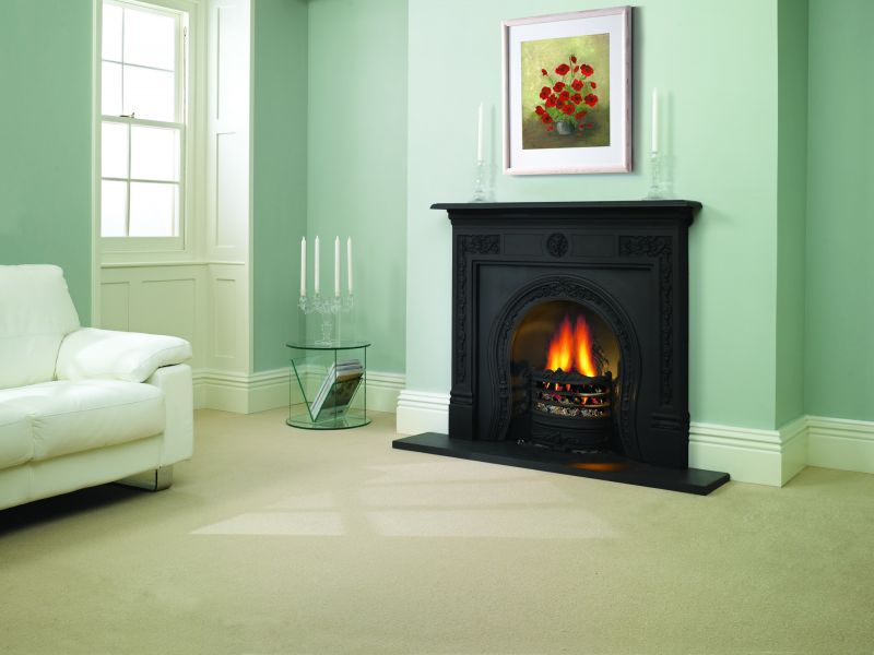
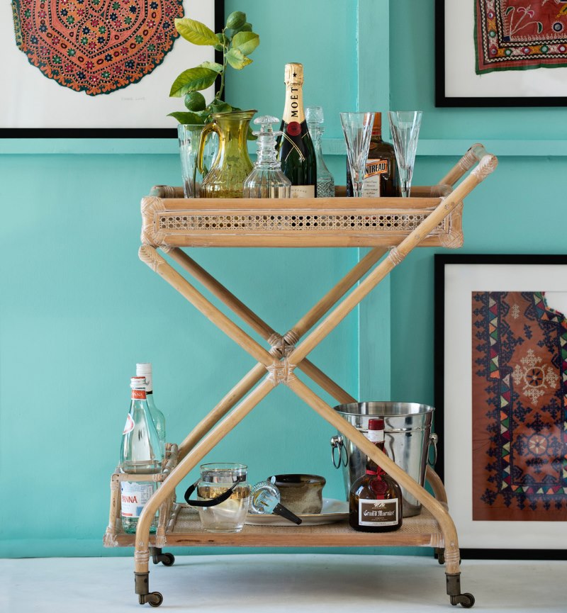
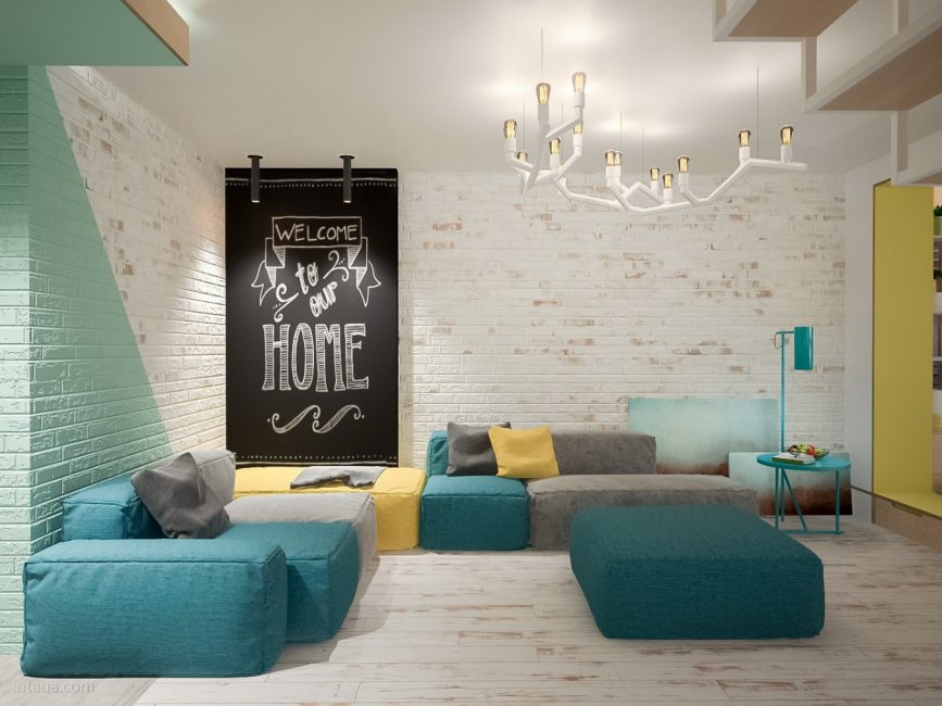
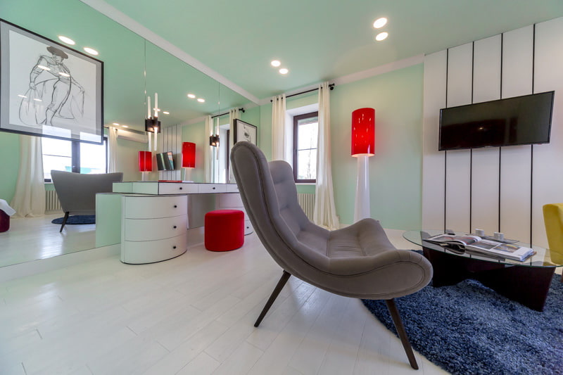
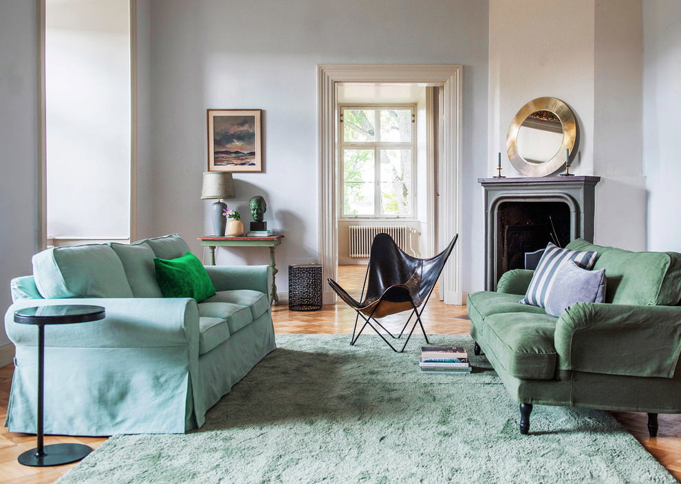
If you want to show all the beauty that this fresh and soft color carries, feel free to combine it with black. Firstly, such a duet looks elegant and exclusive, and secondly, black does not interfere with revealing all the nuances of its color partner. On the contrary, it emphasizes menthol freshness, weightlessness and sophistication of the original shade. In this case, the rule of attraction of two opposites works as well as possible. Two completely different characters - severity and tenderness form a contrasting and stylish union.
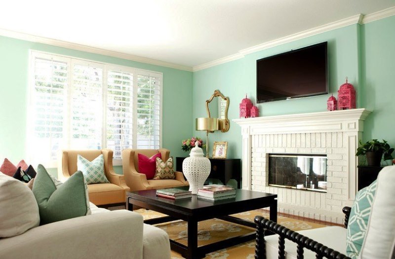
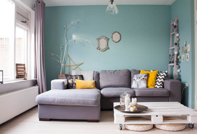
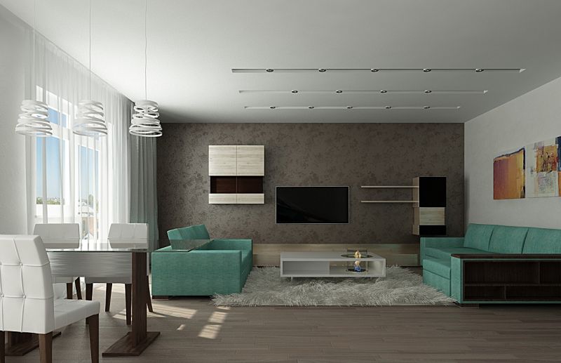
Mint living room with dark accents in the black finish of furniture and TV
The original addition of black to the mint interior
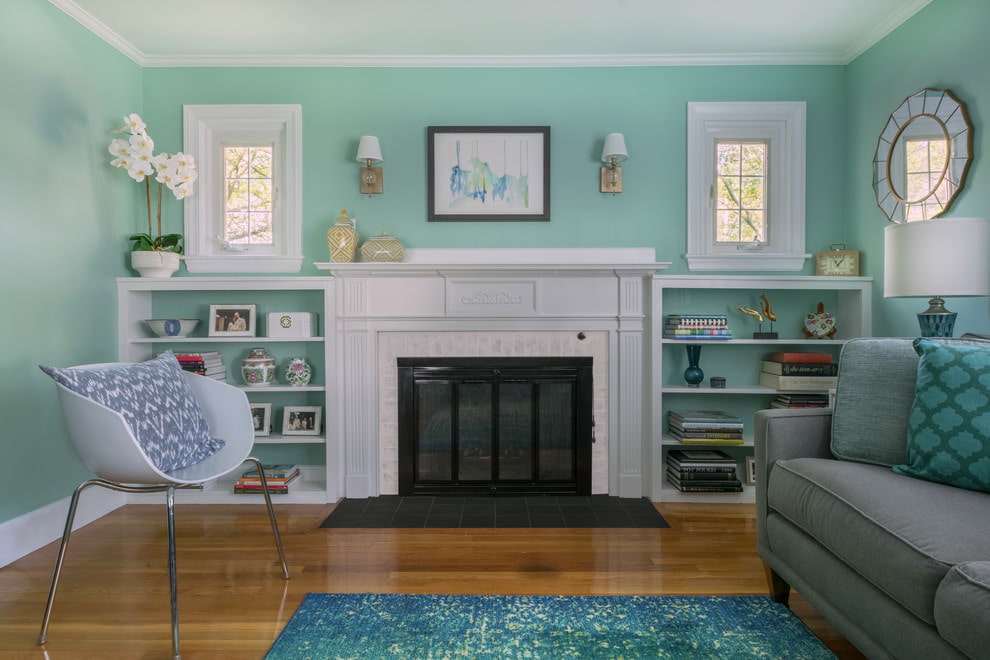
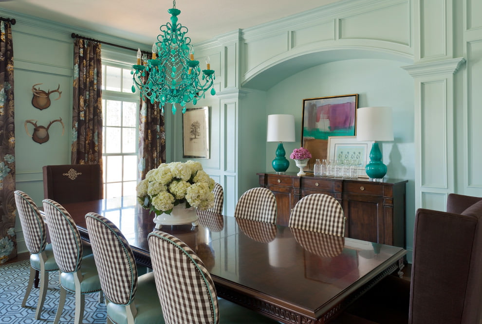
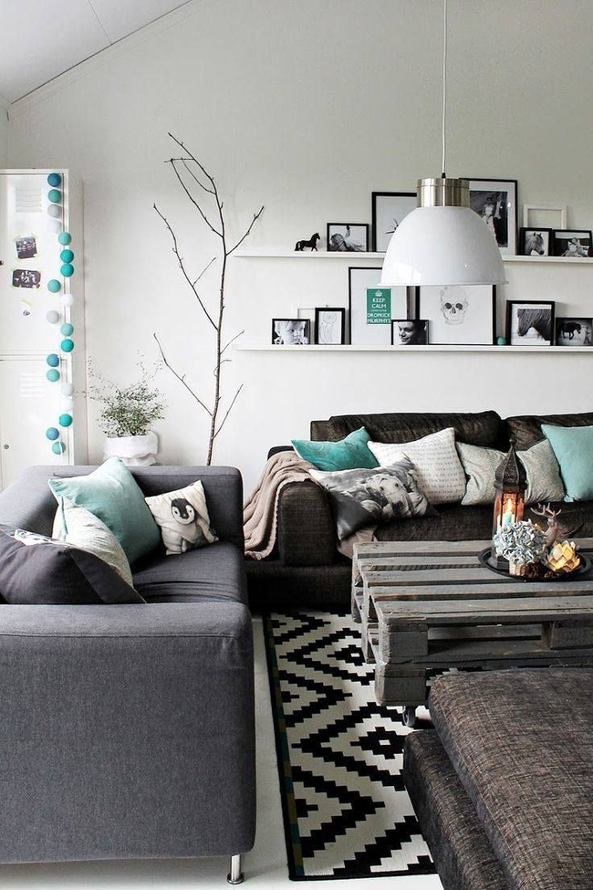
Gray is an attribute of a business, office atmosphere. But it can adequately complement the mint color. Just choose the necessary light shades of gray. In an alliance with menthol, light gray shades will create an airy, almost weightless picture. Such a combination of colors tells a lot - intelligence, moderation, ease, lightness. If you give preference to a more saturated palette - asphalt or anthracite halftones, then the experiment may be unsuccessful - it will be difficult to get rid of the impression of depression.
The gray-mint combination harmoniously looks both in modern styles and traditional interiors
The combination of gray and mint has a lot of nobility and restraint
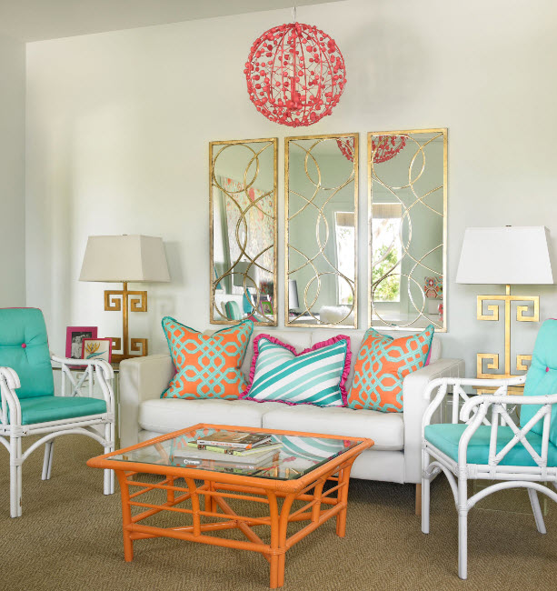
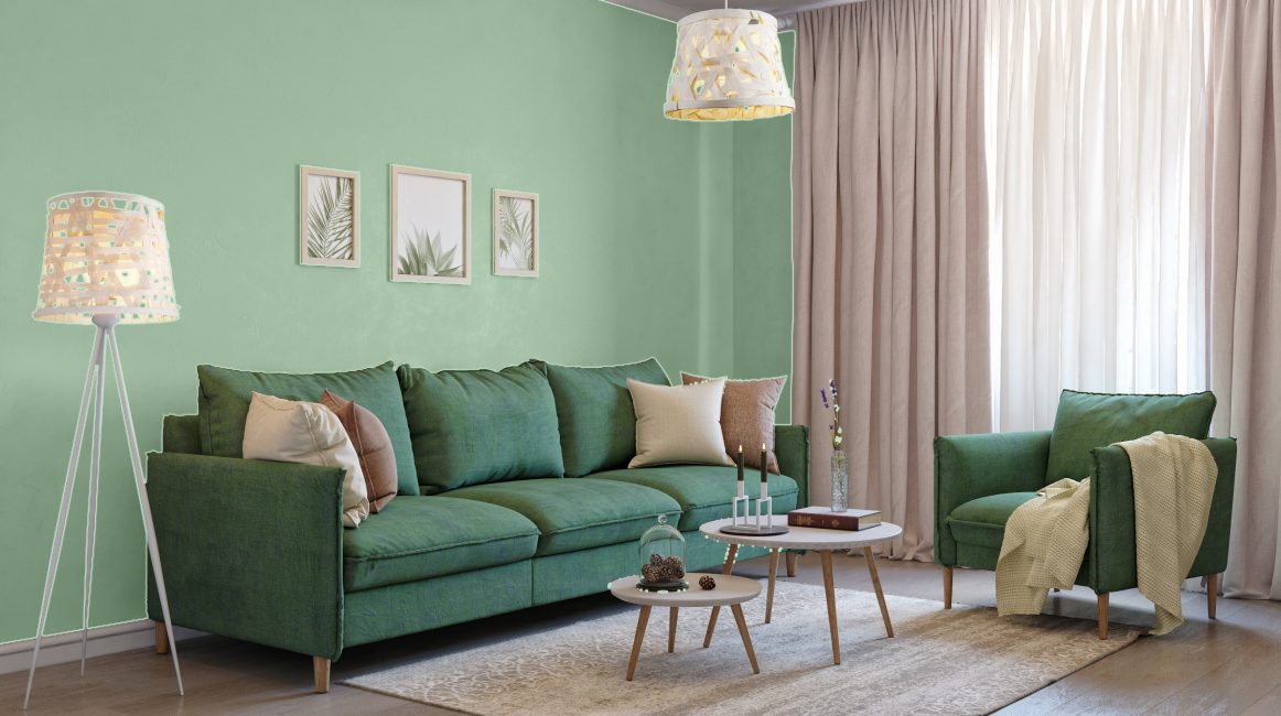
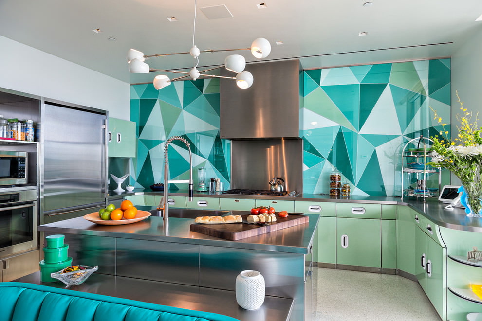
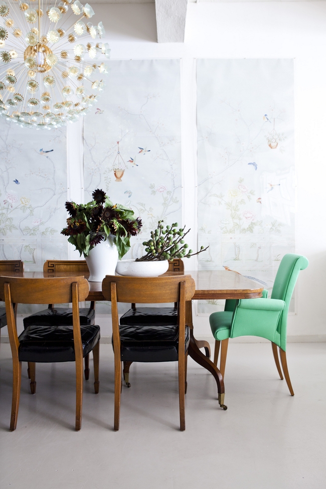
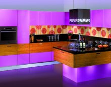
Not only a light palette can become a successful ally of the menthol palette. More expressive shades cope well with this task. Being a representative of the pastel gamut, menthol provides a lot of opportunities for successful experiments. It looks best with green, orange, pink, yellow, coral.
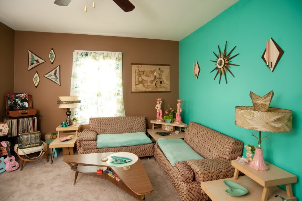
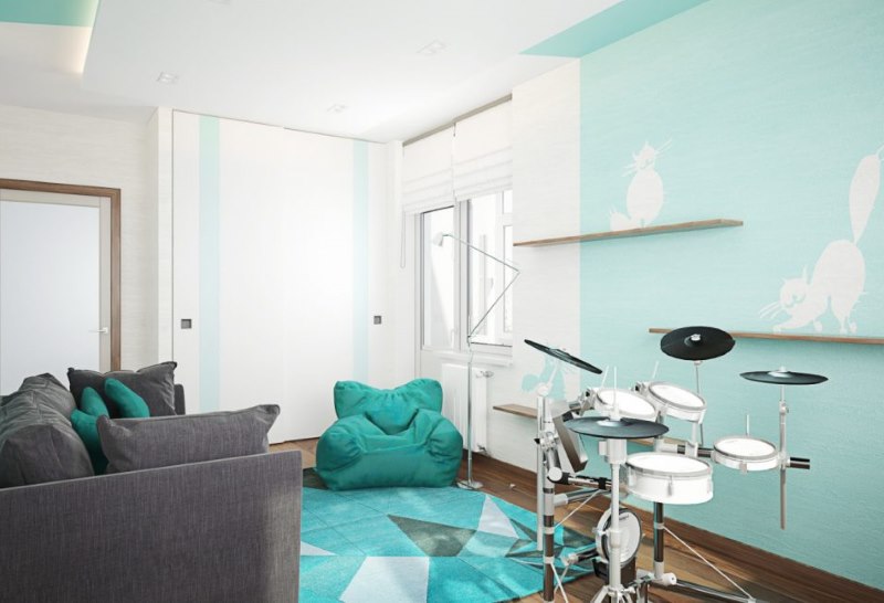
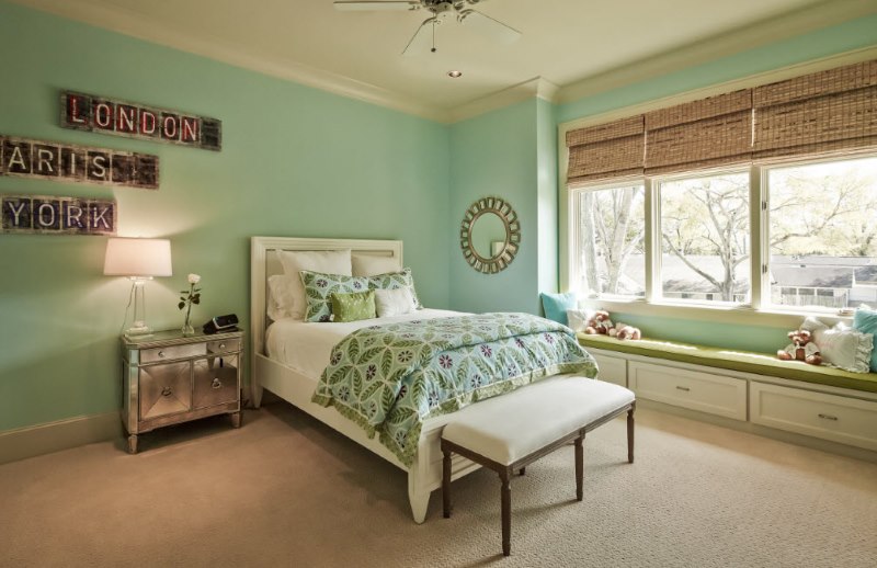
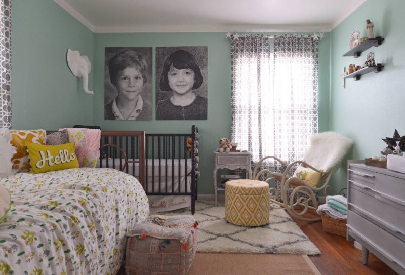
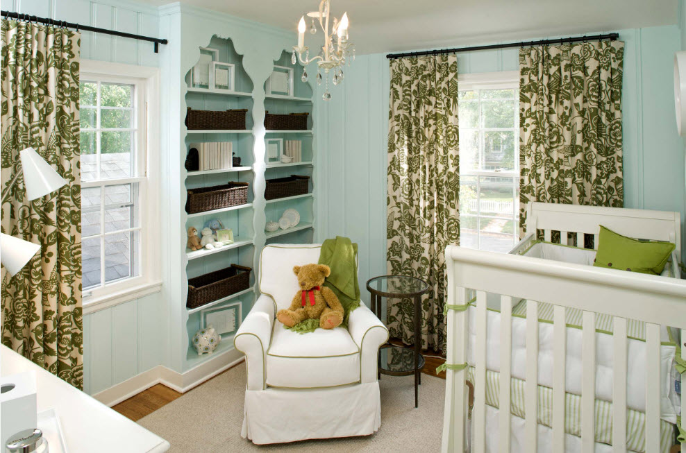
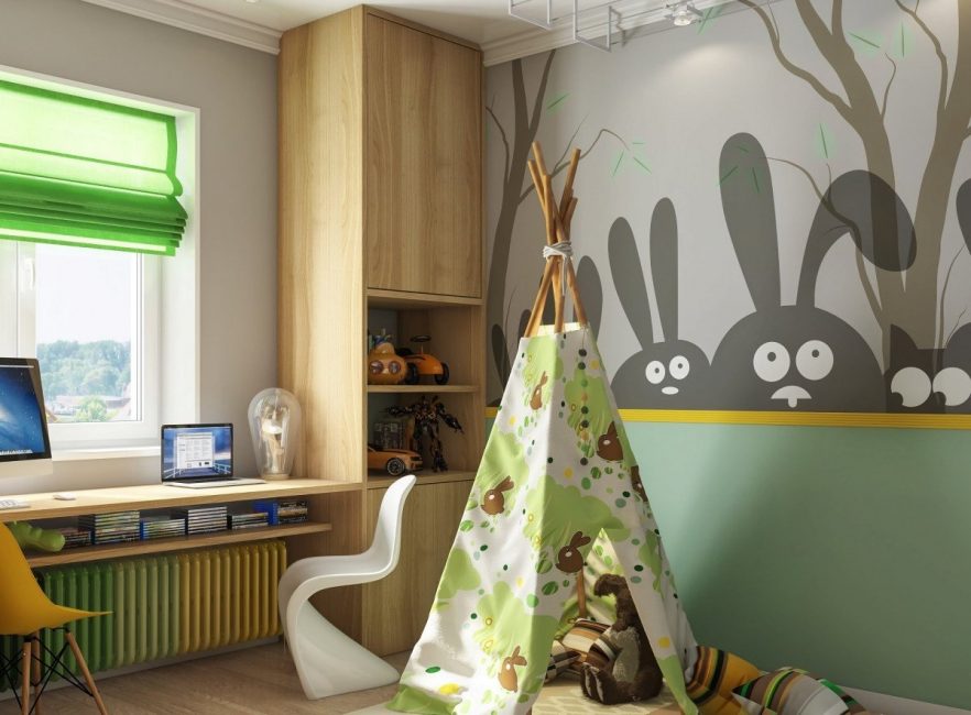
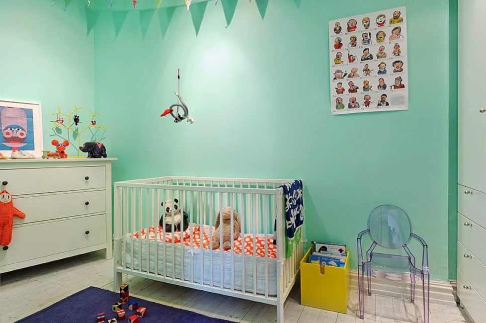
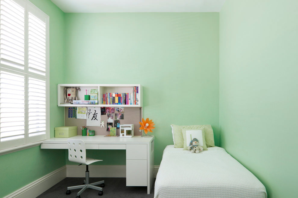
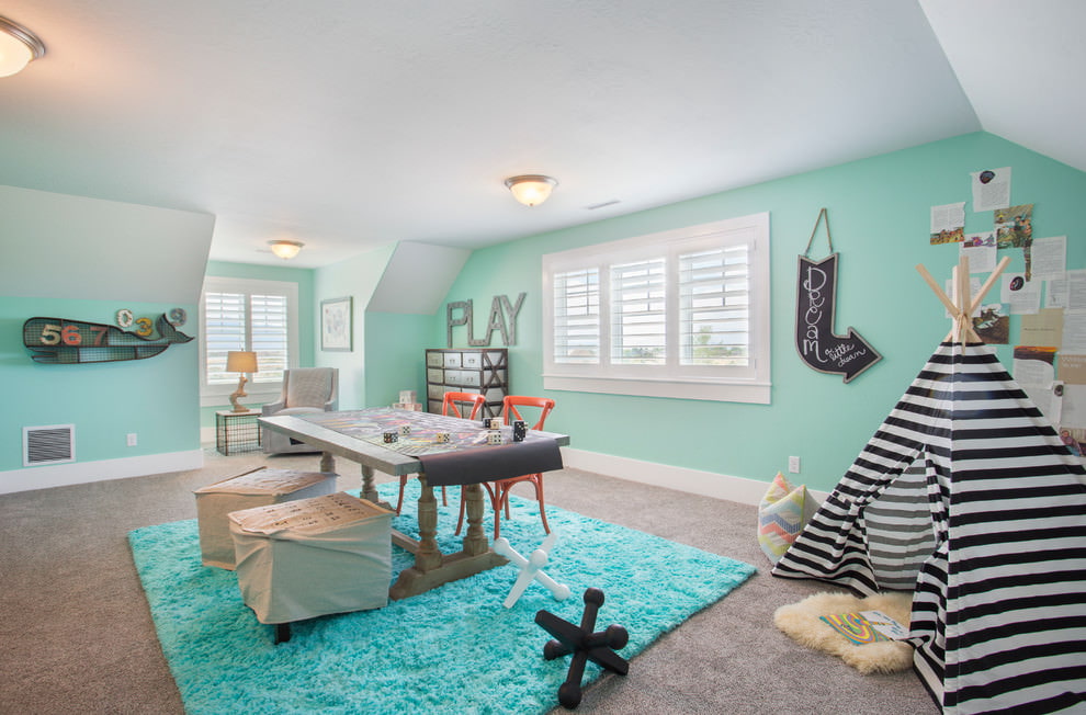
Mint green interior is suitable for the design of a children's room
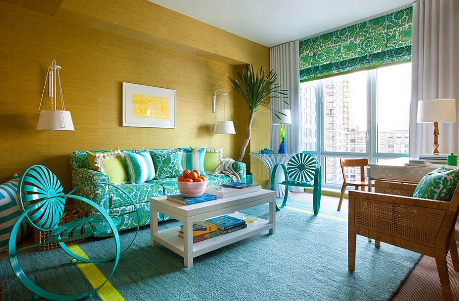
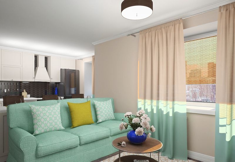
Living room in mint yellow with mint textiles
But we should not forget that a combination of such colorful tones in clothes will be appropriate at a party or a walk. But in the office such a colorful outfit looks ridiculous. In the interior design, such color combinations need to be implemented very carefully, correctly placing bright accents on a pastel background.
Mint color is a symbol of youth, grace, lightness and enthusiasm. This is the best option for creating stylish summer and spring looks. The greenish-blue tones are refreshing, you could even say that they have an anti-aging, anti-aging effect. In the interior, he has a different action - he pacifies and tunes in a positive way. According to psychologists, lovers of this tone are intelligent, intelligent, calm and restrained people. They are distinguished by intelligence, well-read, broad-minded. They know how to behave properly in society, so they look decent in society.
Mint tones look equally attractive both on the main and the auxiliary background
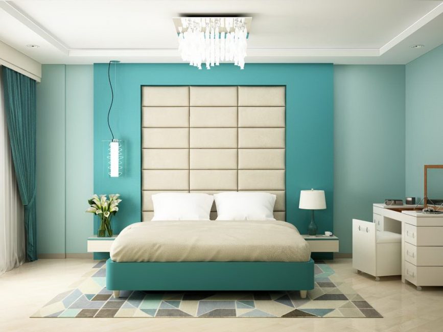
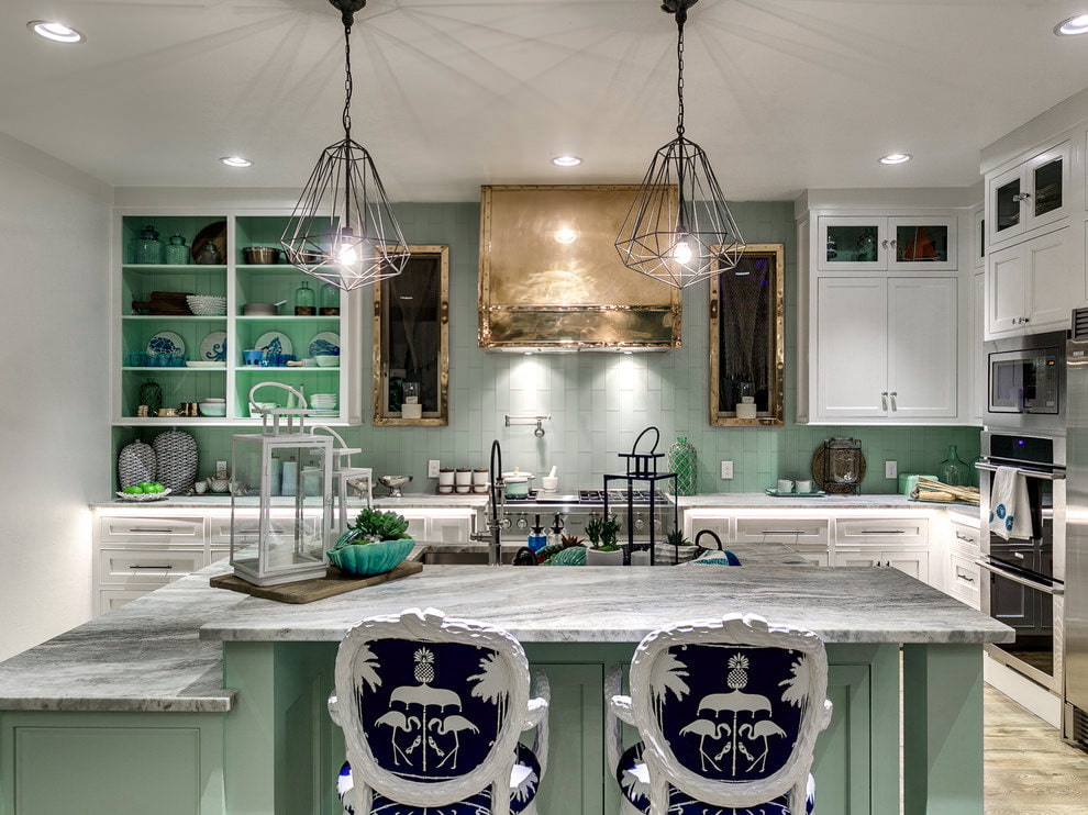
Mint color as a dominant
A color close to nature always has a positive effect on the human psyche. Choosing a mint color as the main one in the interior, designers strive to create a light, fresh and at the same time relaxing, soothing atmosphere. The property of mint to cool and switched to the color associated with this plant. This visual quality is used to eliminate nervous tension, create conditions for moral discharge and rest.
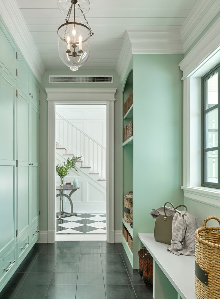
Classic mint interior
Like all green shades, mint color favorably affects the psyche and sets up relaxation
Gray accents make the living room interior more balanced.
Spring lightness and high compatibility allows you to apply this unobtrusive tone paired with many other representatives of the palette. But it is better to avoid supplementing the menthol walls with bright, eye-cutting details, otherwise a faded atmosphere will appear. Although this property of menthol can be advantageously beaten by creating an interior in the Provencal style.
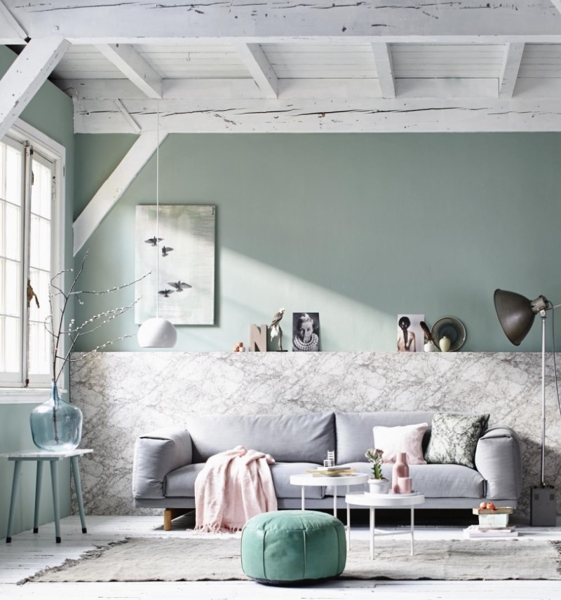
Bright accessory in the form of a “mint” pouf
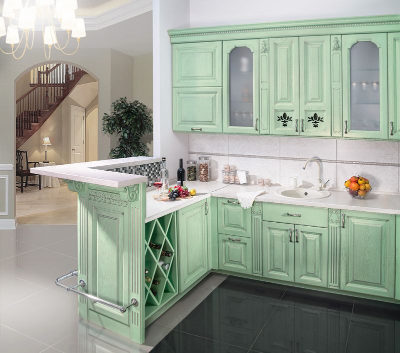
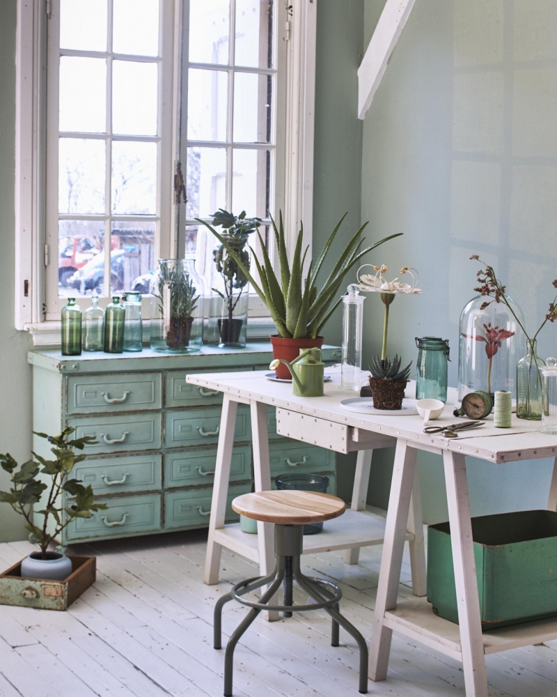
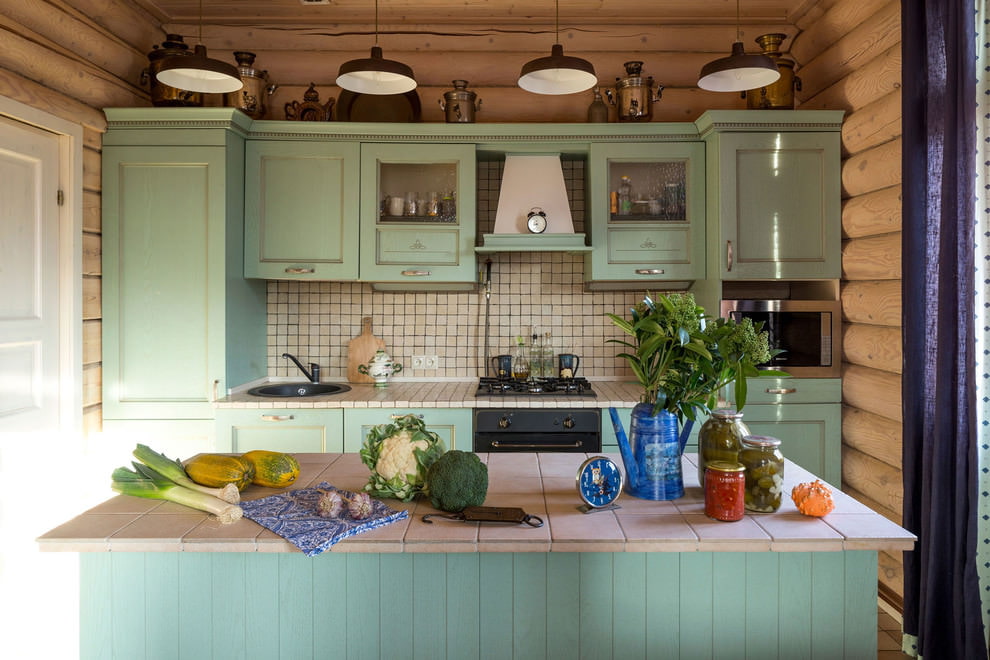
Any wooden decoration always looks profitable against a mint background


Thank!
In the near future we will publish information.